

YOGIMAMA
Repositioning and expanding the story of an established birth brand for its next chapter.
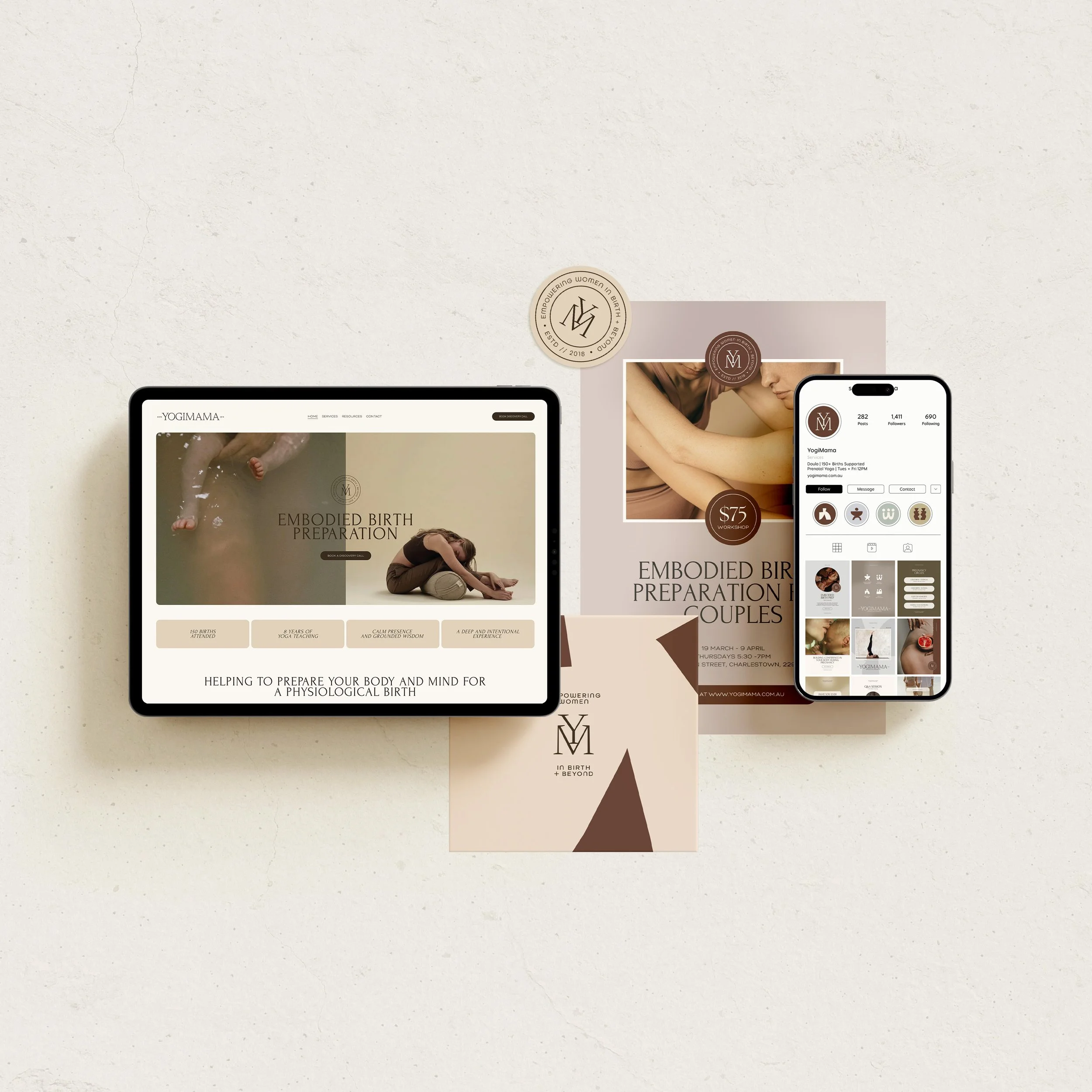
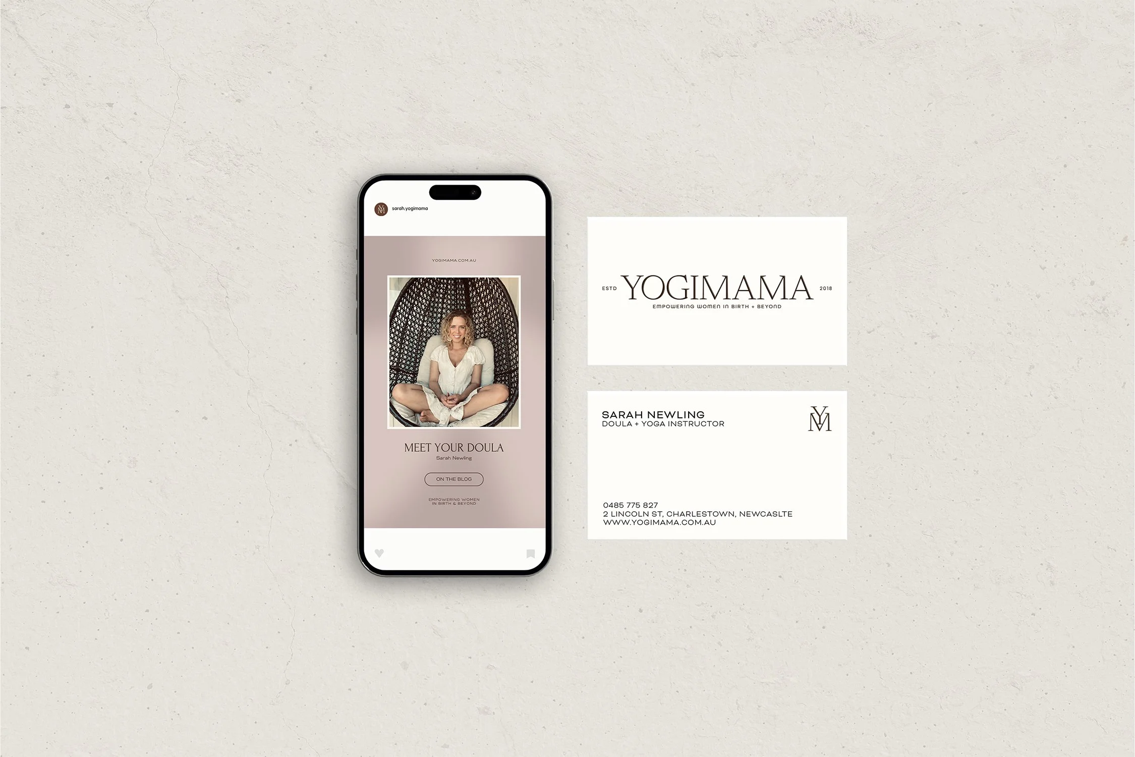
Yogimama is an established Newcastle birth and maternal wellbeing business supporting women and couples through pregnancy, birth and the transition into parenthood. As the business evolved, its identity needed to evolve with it. What had begun with a strong association to prenatal yoga had grown into a much broader offering spanning birth preparation, doula support, education and mentoring. The project became an opportunity to reposition Yogimama around the depth of that work — creating a brand that felt grounded, contemporary and distinctly its own, while retaining the warmth and trust already built around the business.
1. THE CHALLENGE
When the business has grown beyond the story its brand is telling.
The challenge was to close the gap between the perception of Yogimama and the work the business had grown to encompass.
Its name carried valuable recognition, but could also suggest a business centred primarily around yoga. In reality, Yogimama had become a much richer support system for women and families navigating pregnancy and birth. The new identity needed to broaden that perception without abandoning the equity already held in the name.
It also needed to navigate a category often dominated by predictable visual cues — soft femininity, muted wellness branding and familiar maternal imagery. Yogimama needed to feel nurturing without becoming delicate, knowledgeable without becoming clinical, and confident without losing the intimacy at the heart of Sarah’s work.
Rather than changing the business to fit a new identity, the challenge was to create an identity capable of revealing what was already there.
2. THE APPROACH
Building the identity around what YogiMama had become - with enough room for where it was going next.
The brand was repositioned around the idea of helping women to trust their power through birth - shifting the focus from a particular modality to the experience and support Yogimama provides.
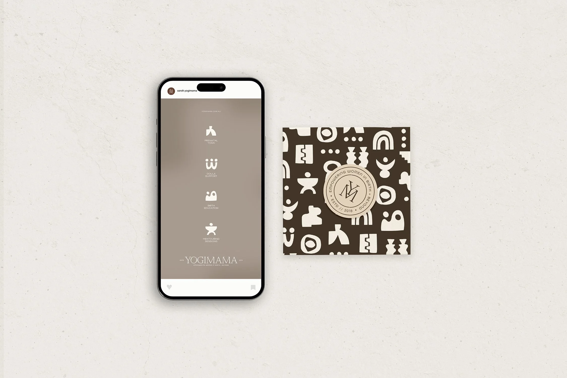
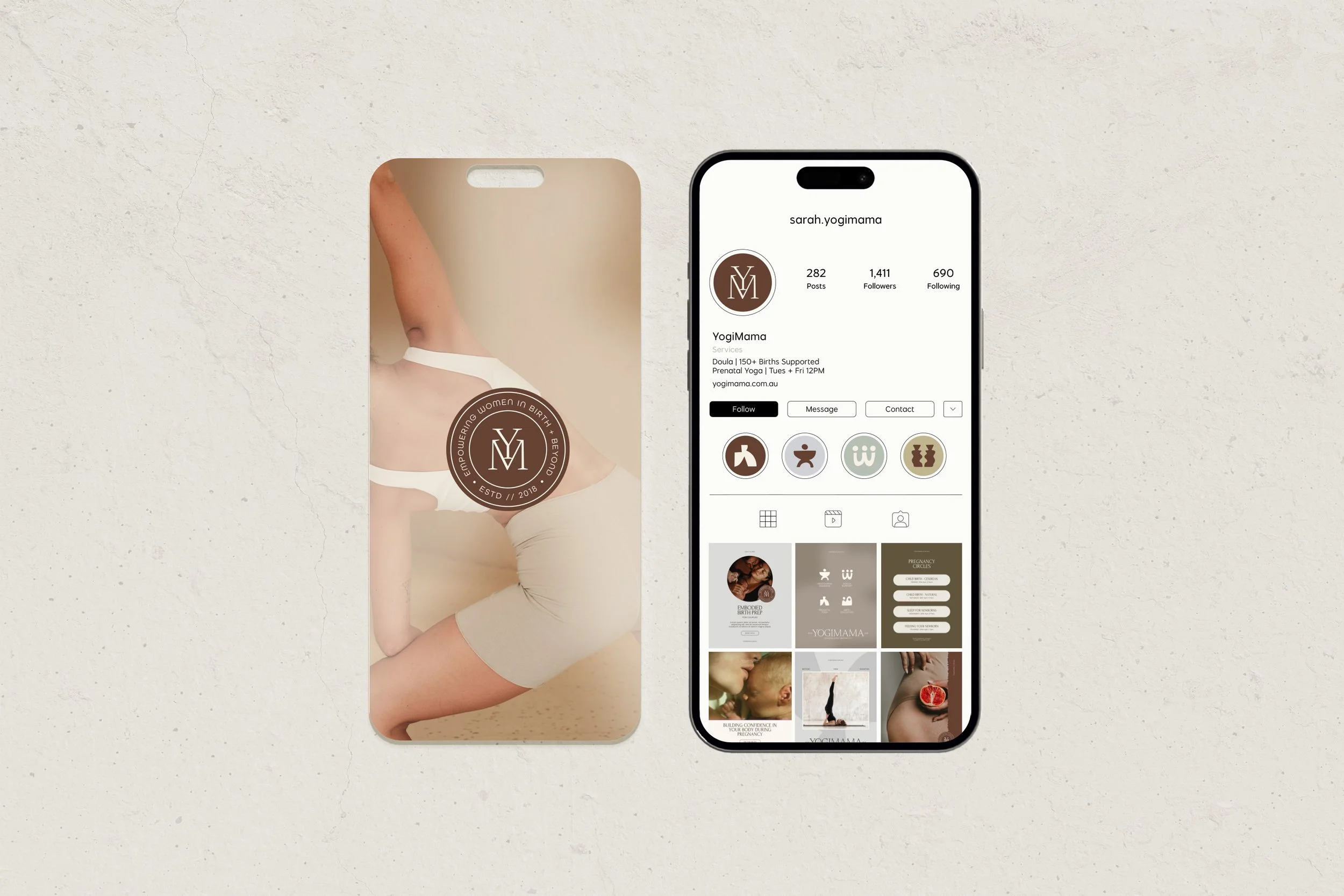
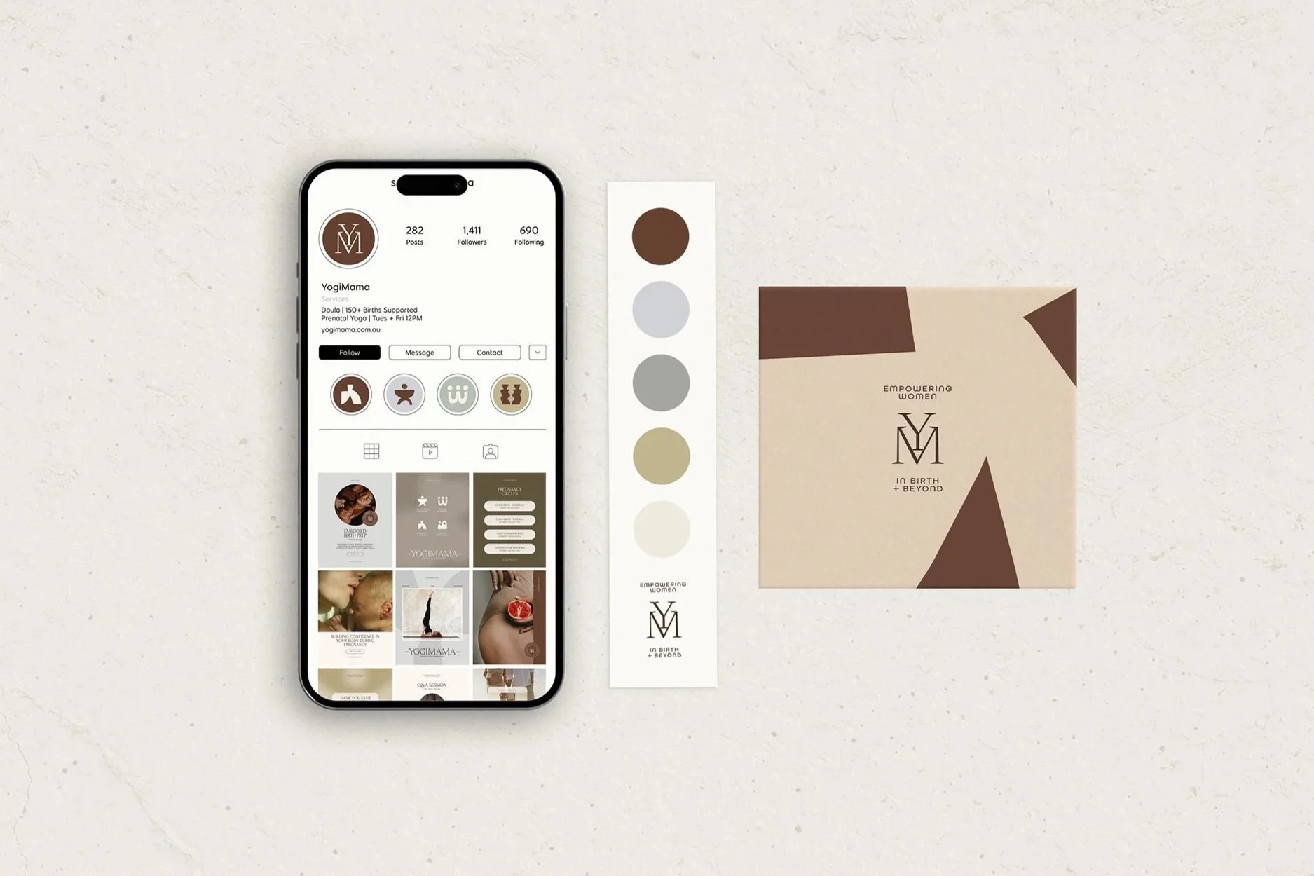
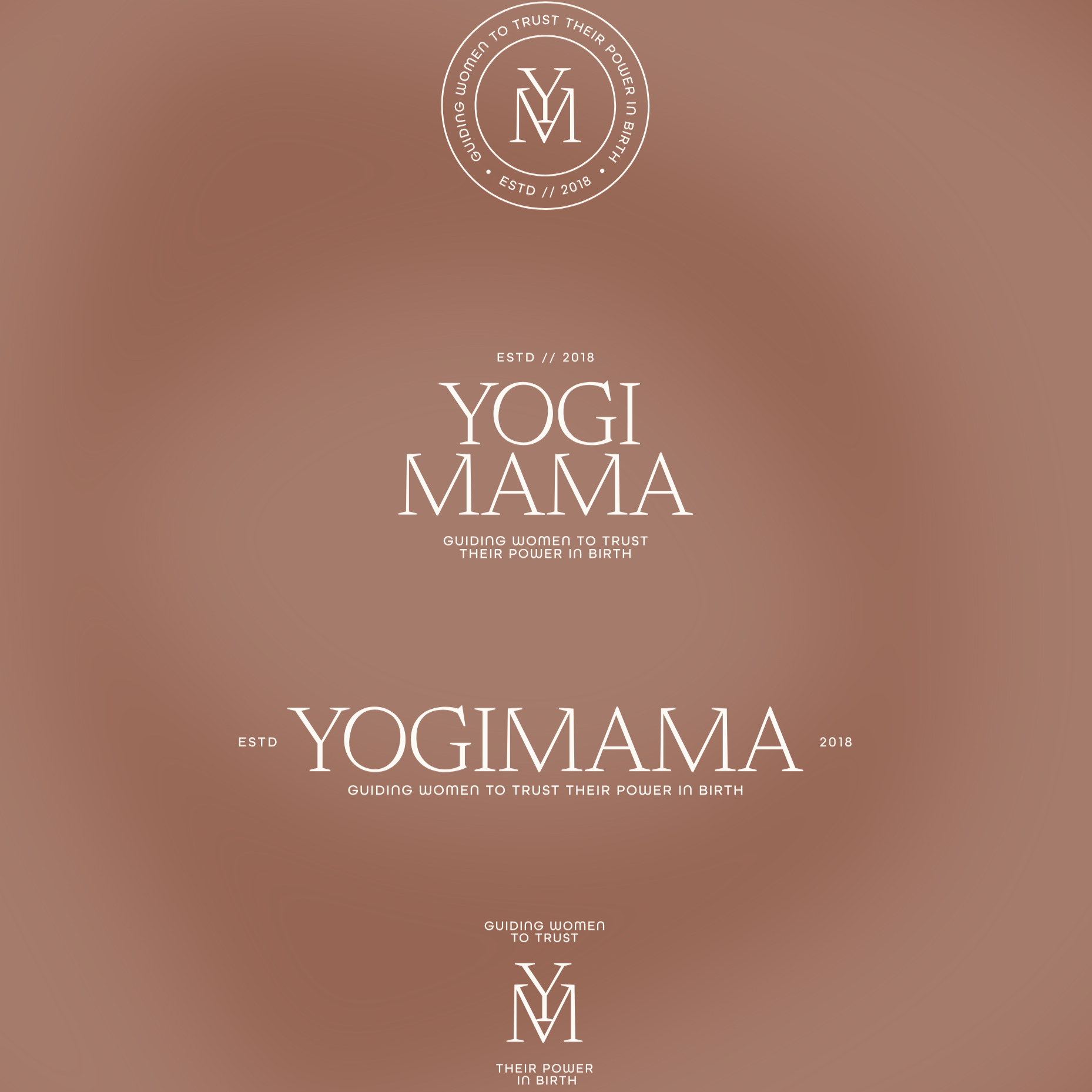
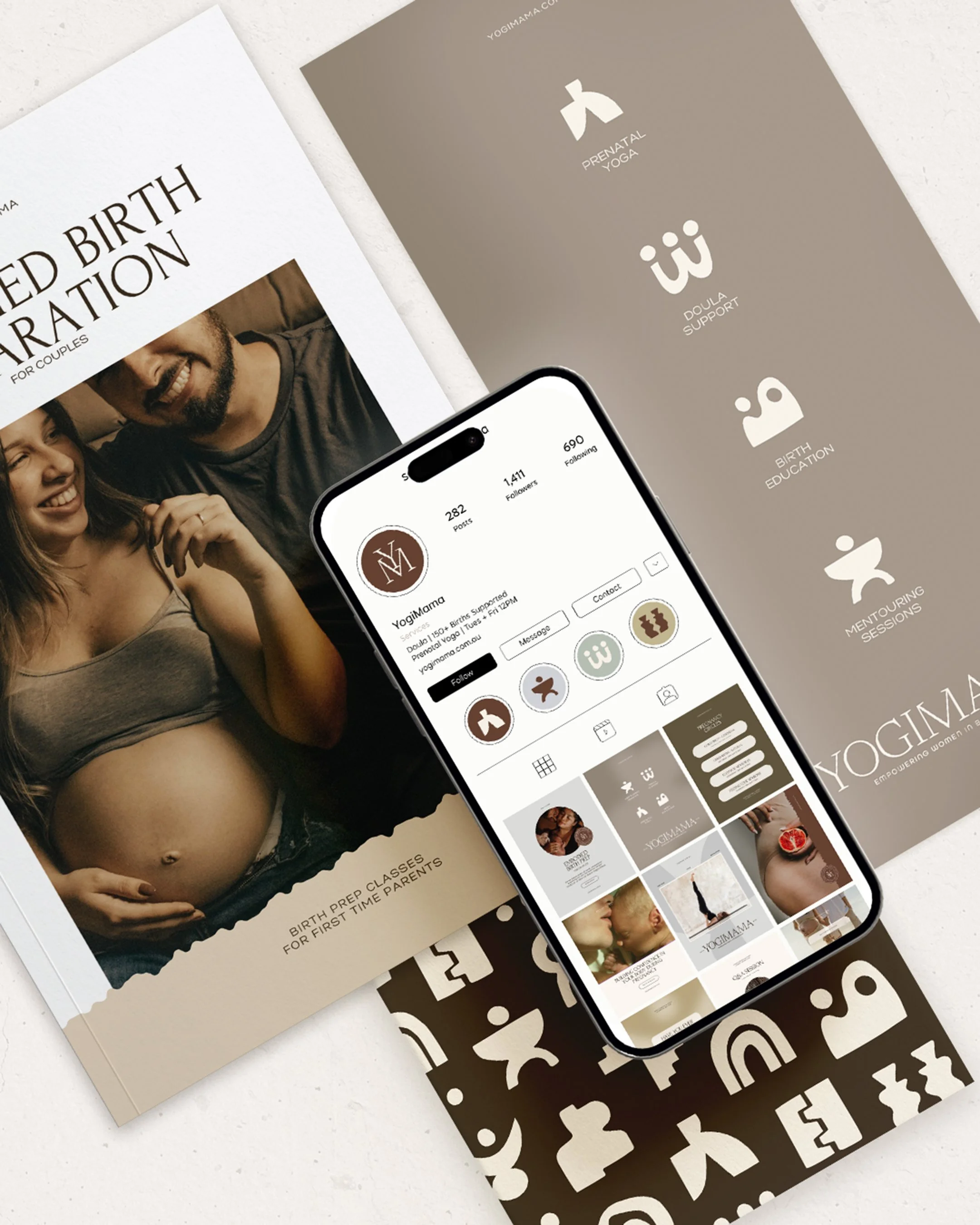
From there, the visual identity was built around the depth of emotions surrounding the birth experience. A refined typographic wordmark brings maturity and authority, while a series of bold, abstract symbols introduces warmth, movement and personality. Each symbol gives Yogimama’s different services a recognisable visual language of their own while allowing them to remain part of one connected system.
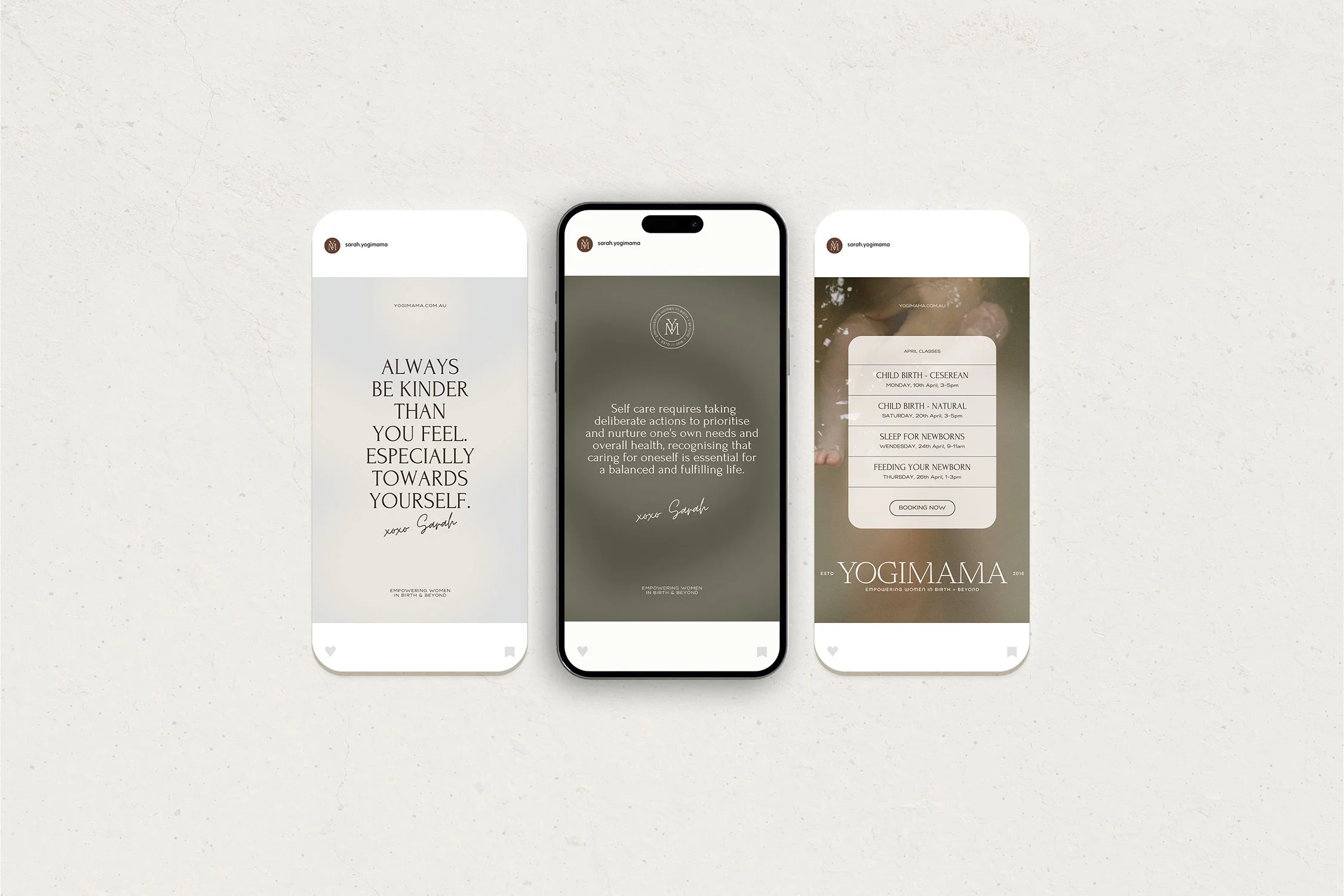
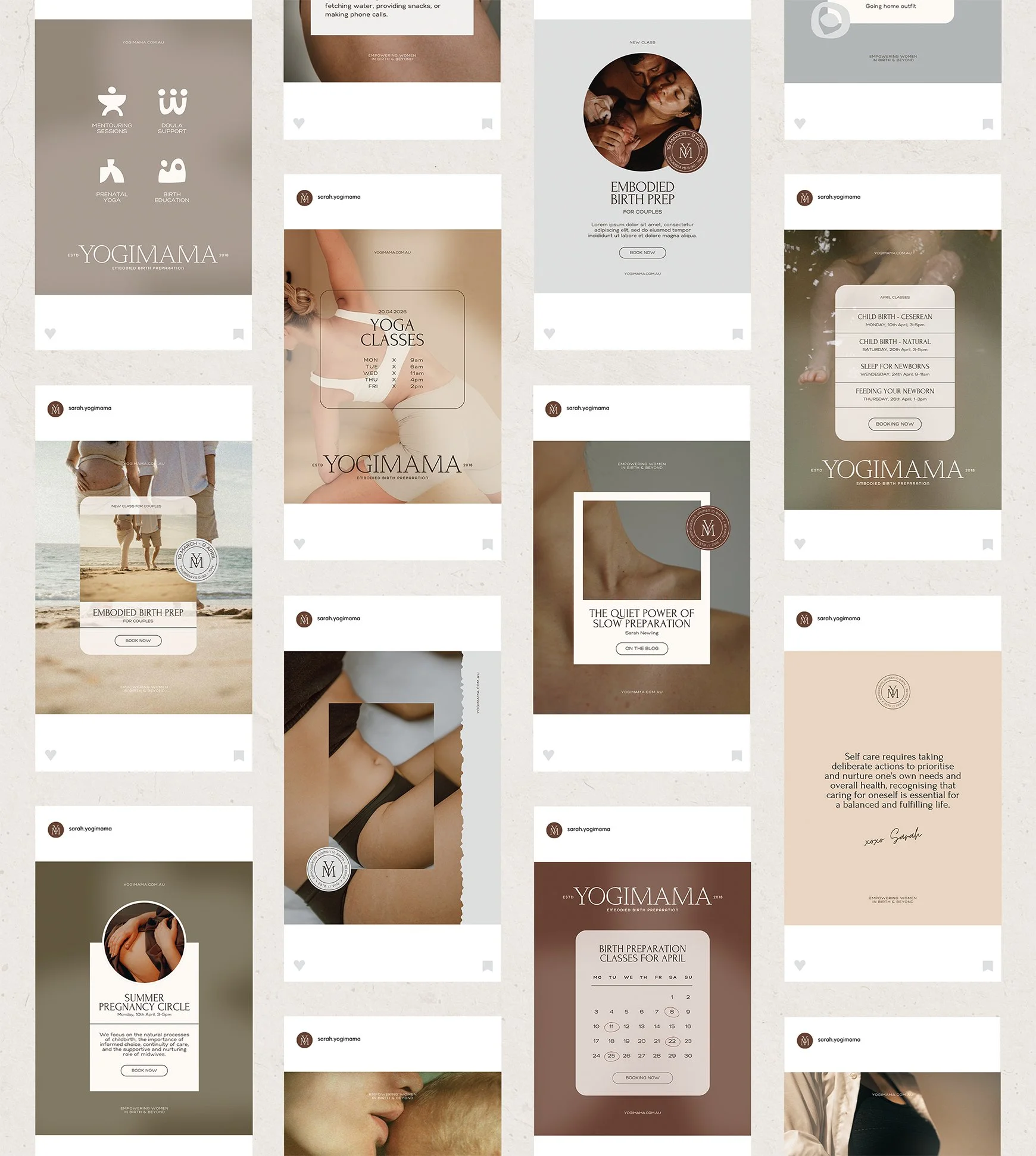
The palette moves away from conventional pregnancy and wellness colours towards earthy browns, warm neutrals, soft mineral tones and unexpected cooler accents. Combined with intimate, honest photography and generous typography, it creates a world that feels calm and considered without becoming overly polished or precious.
The aim throughout was not simply consistency. It was to give Yogimama enough visual vocabulary to communicate many different kinds of information while remaining unmistakably itself.
3. THE EXPERIENCE
Creating a flexible visual world designed to work wherever the brand shows up.
The identity was designed as a working system rather than a collection of isolated brand assets.
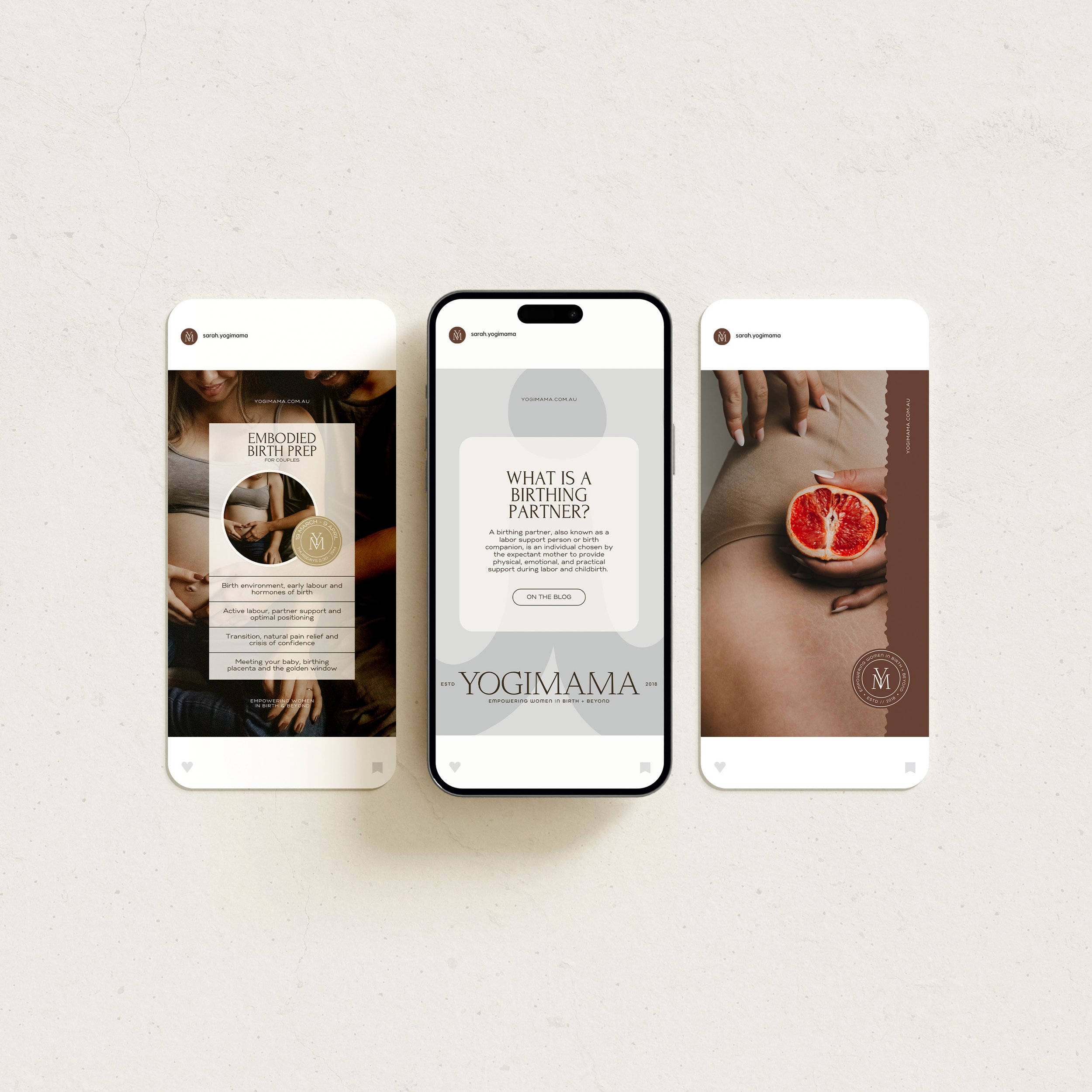
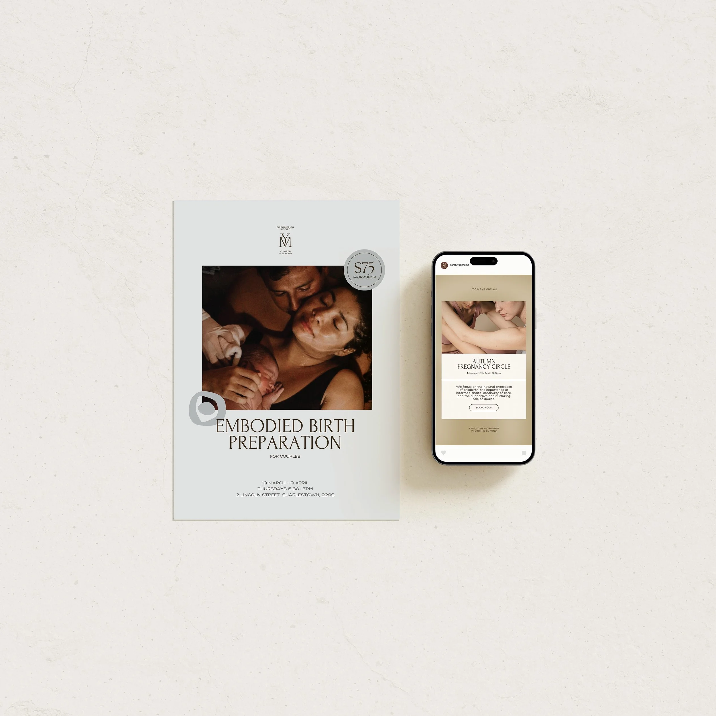
Across the website, social media, workshops, education, print and promotional material, the same visual language can expand and contract depending on what needs to be communicated. Service symbols become navigation devices and social markers. The monogram works as a stamp of recognition. Graphic forms become patterns, crops and compositional elements. Photography can move between quiet, intimate moments and more practical educational content without breaking the world of the brand.
This flexibility is particularly important for a business like Yogimama, where the experience moves between deeply personal one-to-one support, group education, practical information and community.
Together, these touchpoints create an experience that feels cohesive without feeling repetitive - allowing the brand to remain recognisable while giving YogiMama room to keep evolving.
4. THE OUTCOME
An identity with enough structure to feel established, and enough room to keep evolving.
The new identity gives Yogimama a clearer expression of the business it has become.
Rather than being visually anchored to prenatal yoga alone, the brand can now comfortably hold birth preparation, doula support, education, mentoring and future offerings within one recognisable world. It feels more established and confident, while retaining the warmth and humanity that are fundamental to Sarah’s relationship with her clients.
Most importantly, the identity has created room for growth. New services, workshops and conversations can be introduced without requiring the brand to reinvent itself each time.
It is a brand with enough structure to be consistent, and enough flexibility to continue changing alongside the women it exists to support.
5. FINAL THOUGHTS
Sometimes a rebrand isn’t about becoming something new. It’s about making what is already there easier to see.
YogiMama is a good example of why I believe a rebrand should begin long before decisions about logos, colours or typography.
Sometimes the most important part of the work is recognising that a business has quietly outgrown the story its existing identity is telling.
By looking first at what YogiMama had become, what needed to remain and where Sarah wanted to take it next, the visual direction had something meaningful to respond to. The resulting identity does more than make the business look different. It helps the outside expression of YogiMama catch up with the depth of the work happening inside it.
For me, that is where brand strategy becomes most valuable: not in inventing a new story, but in making the right one easier to see.