

BLOSSOM CHIROPRACTIC
Building a women-centred chiropractic brand from the ground up.
Blossom Chiropractic is a Newcastle practice created for chiropractor Elena as she stepped out from an established clinic to build a business of her own.
Starting with a blank slate created an opportunity to look beyond what a chiropractic practice was expected to be and ask what this one could uniquely become. Through the strategy process, Meridian identified a more focused opportunity around women’s health - creating a practice designed to support women through the changing stages, demands and experiences of their lives.
From that strategic foundation, Blossom was developed as a complete brand experience spanning positioning, identity, language, website and physical environment. The result is a practice with a distinctive point of view from the outset, rather than another chiropractic brand differentiated by aesthetics alone.


1. THE CHALLENGE
Finding a meaningful place to stand in a category where many practices look and sound the same.
The opportunity with Blossom wasn't to refresh an existing identity. There wasn't one. Elena was building her own practice for the first time, giving us the rare opportunity to consider the business, brand and experience together from the beginning.
The challenge was deciding what would make it meaningfully different.
Chiropractic is a crowded category, with many practices competing around similar services and broad promises of health, movement and family wellbeing. Simply creating a more beautiful version of the same thing wouldn't give Blossom a strong enough reason to exist.
The strategic work therefore focused on finding the intersection between Elena's experience, the people she was best placed to support and an opportunity within the local market. That process revealed a much more distinctive territory: a chiropractic practice centred primarily around women and the different contexts in which they seek care.
2. THE APPROACH
Shifting the conversation from chiropractic services to the lives of the women seeking them.
Rather than positioning Blossom around a list of treatments, the strategy began by mapping the different stages and experiences of the women the practice could serve.
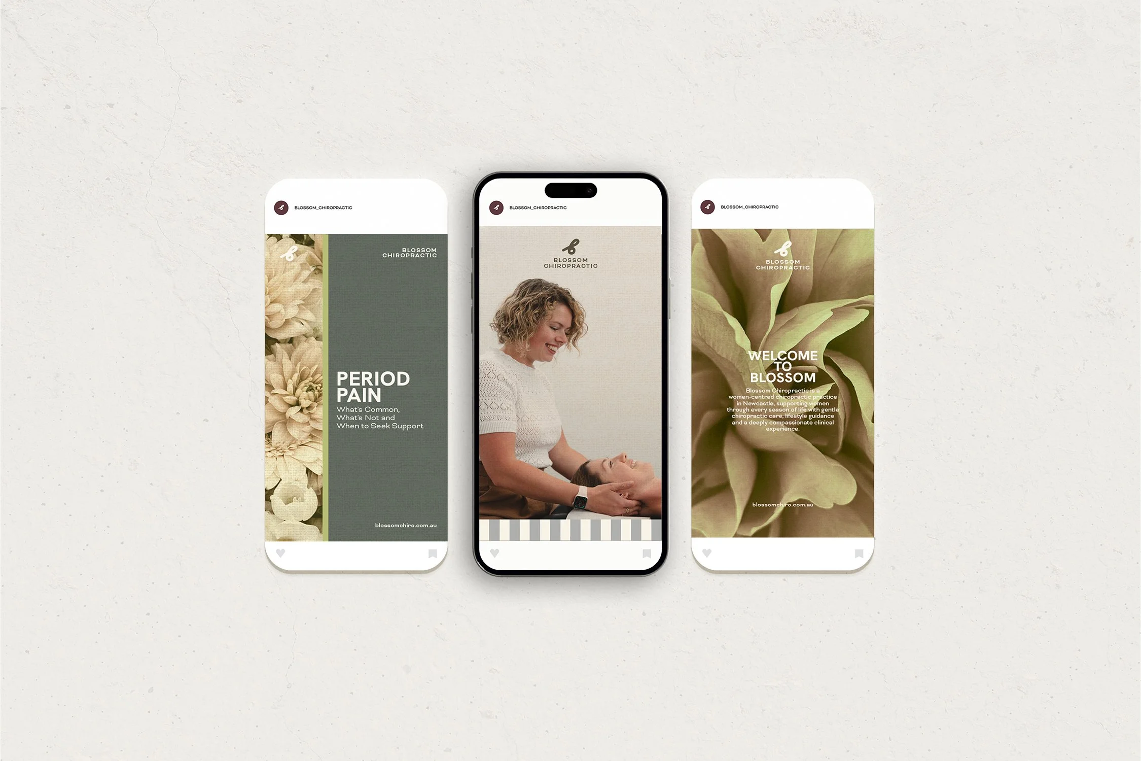
Teenage years and changing bodies. Conception and pregnancy. Postpartum recovery. Motherhood and the physical and emotional load that can accompany it. Alongside these were the everyday factors that don't fit neatly into one life stage — stress, sleep, movement, nutrition, responsibilities and the feeling of continually putting everyone else first.
This led to the central brand idea: For the seasons of womanhood.
It reframed Blossom from simply being a chiropractor for women into a practice designed around the changing context of women's lives. Babies and children could remain naturally within that ecosystem of care, without pulling the positioning back towards the broad territory of family chiropractic.
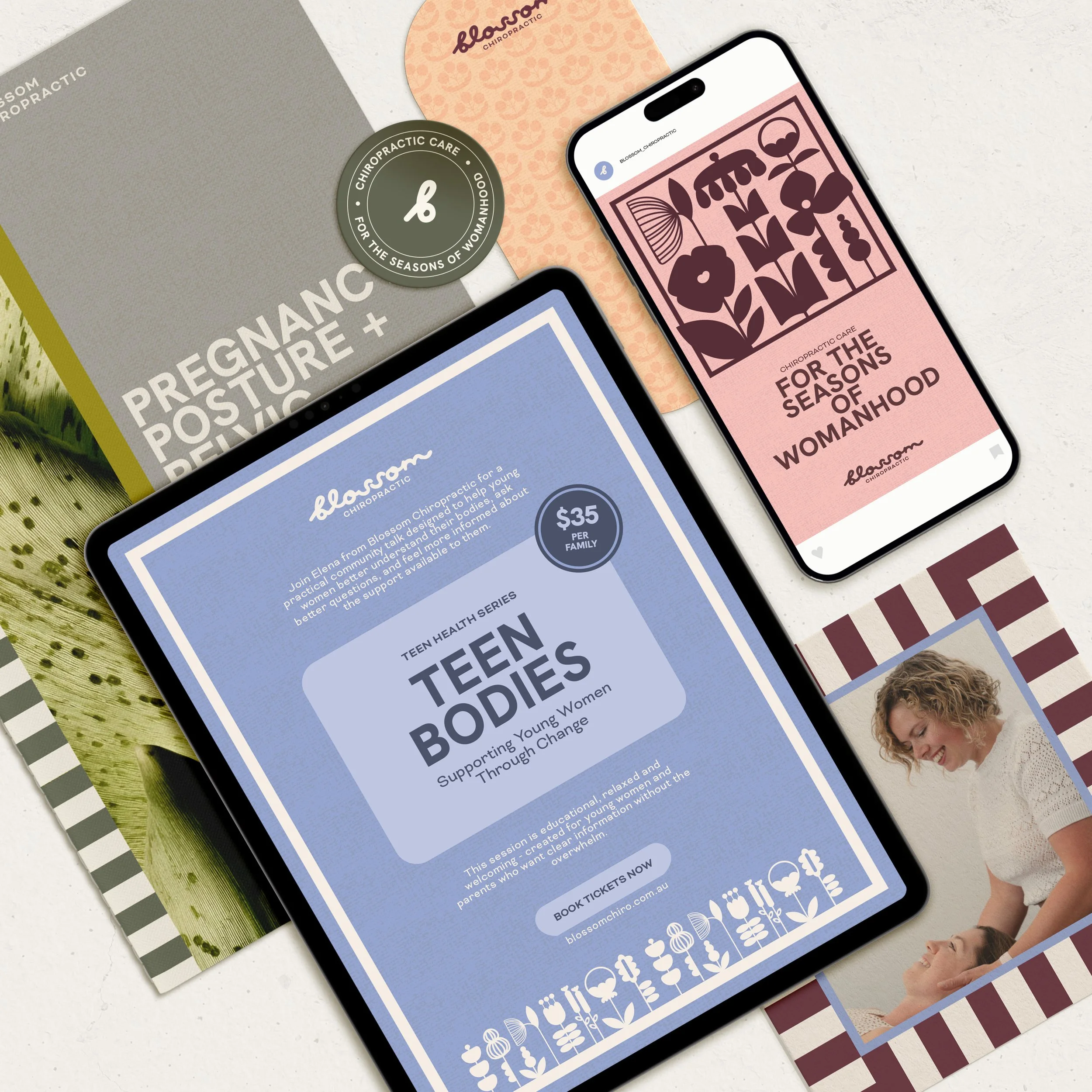
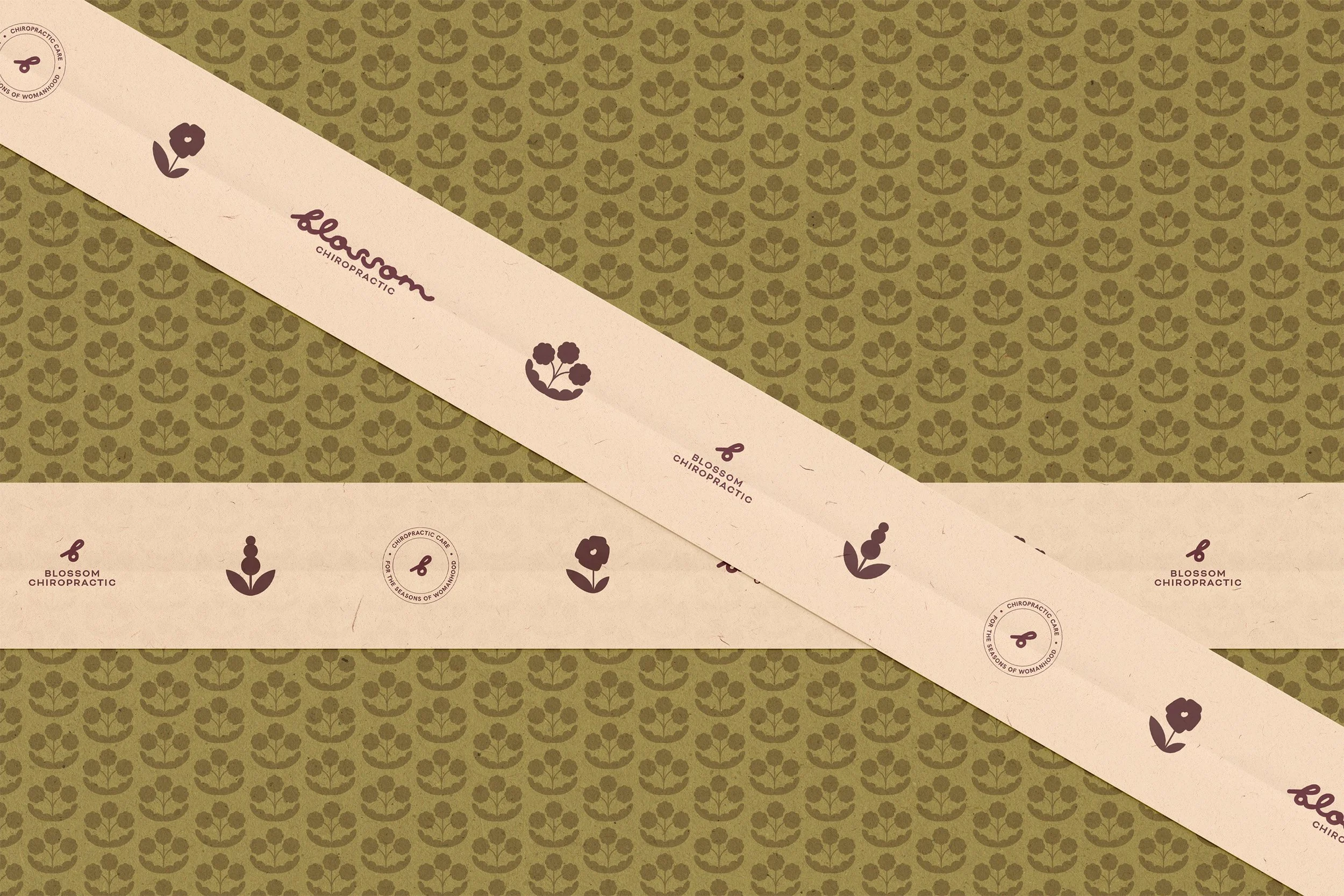
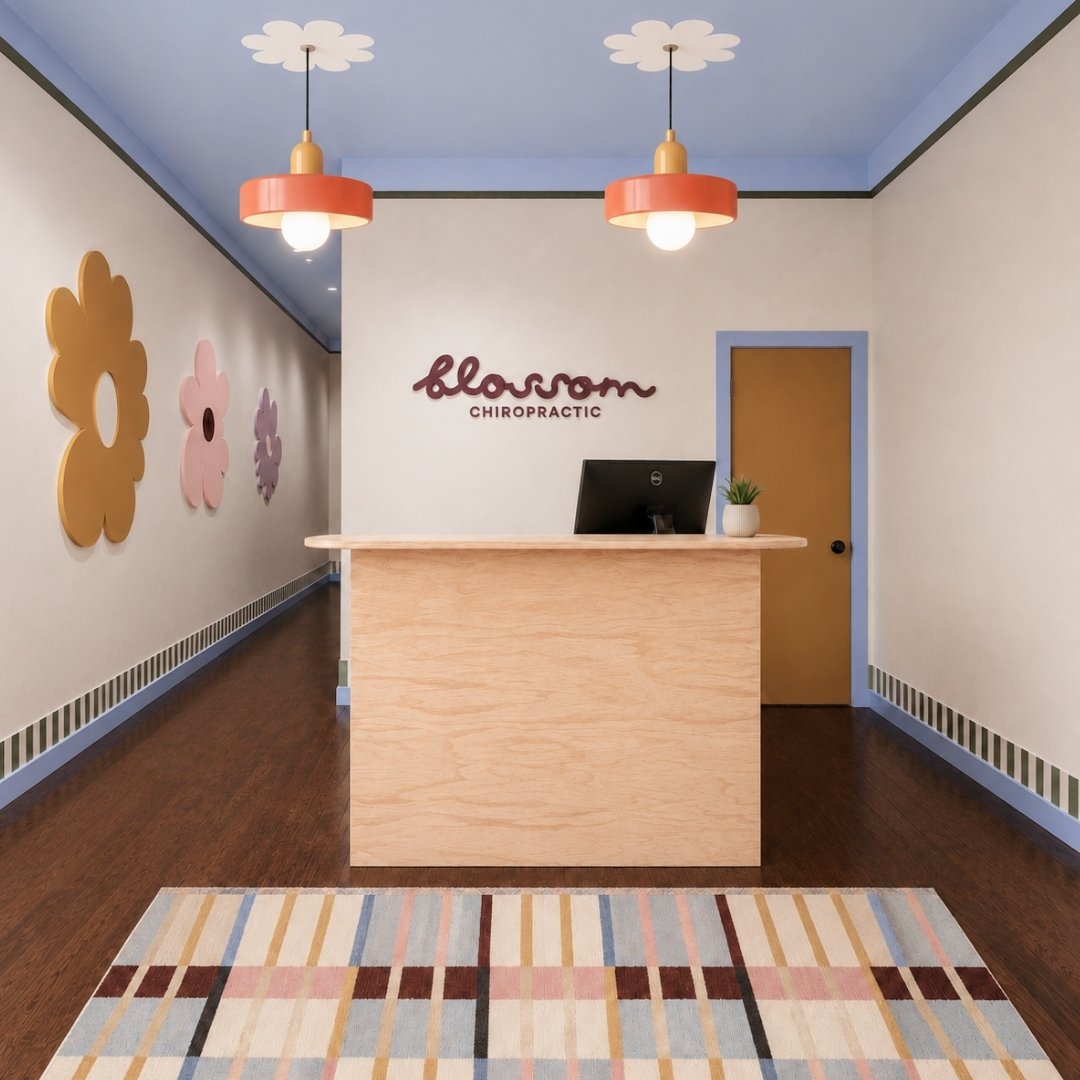
The identity then grew from this strategy. Botanical forms became a visual expression of growth, change and seasonality, while richer colour, confident typography and unexpected imagery moved the brand away from both conventional healthcare and overly delicate feminine wellness aesthetics.
3. THE EXPERIENCE
Turning the positioning into something that could be felt before, during and after an appointment.
Once the strategic idea was clear, it became a filter for every subsequent decision.
The website was structured around the experiences and questions women might arrive with rather than simply organising information around chiropractic services. The language acknowledges the wider context surrounding how people feel, while remaining clear about the role of chiropractic care.
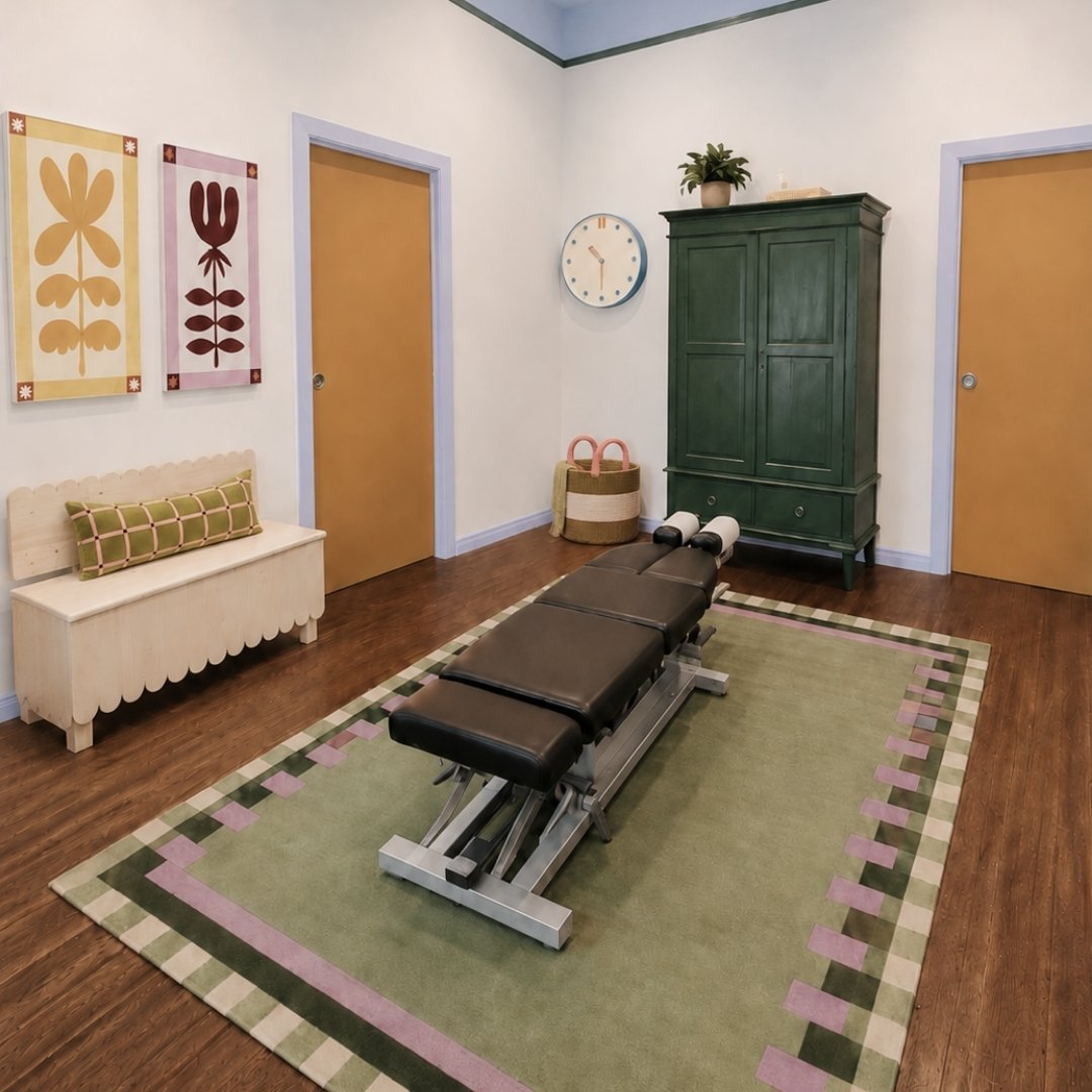
The physical practice extended that thinking further. Rather than designing a generic clinical environment and adding Blossom branding afterwards, colour, botanical artwork, signage, materials and styling were considered as part of the brand experience itself.
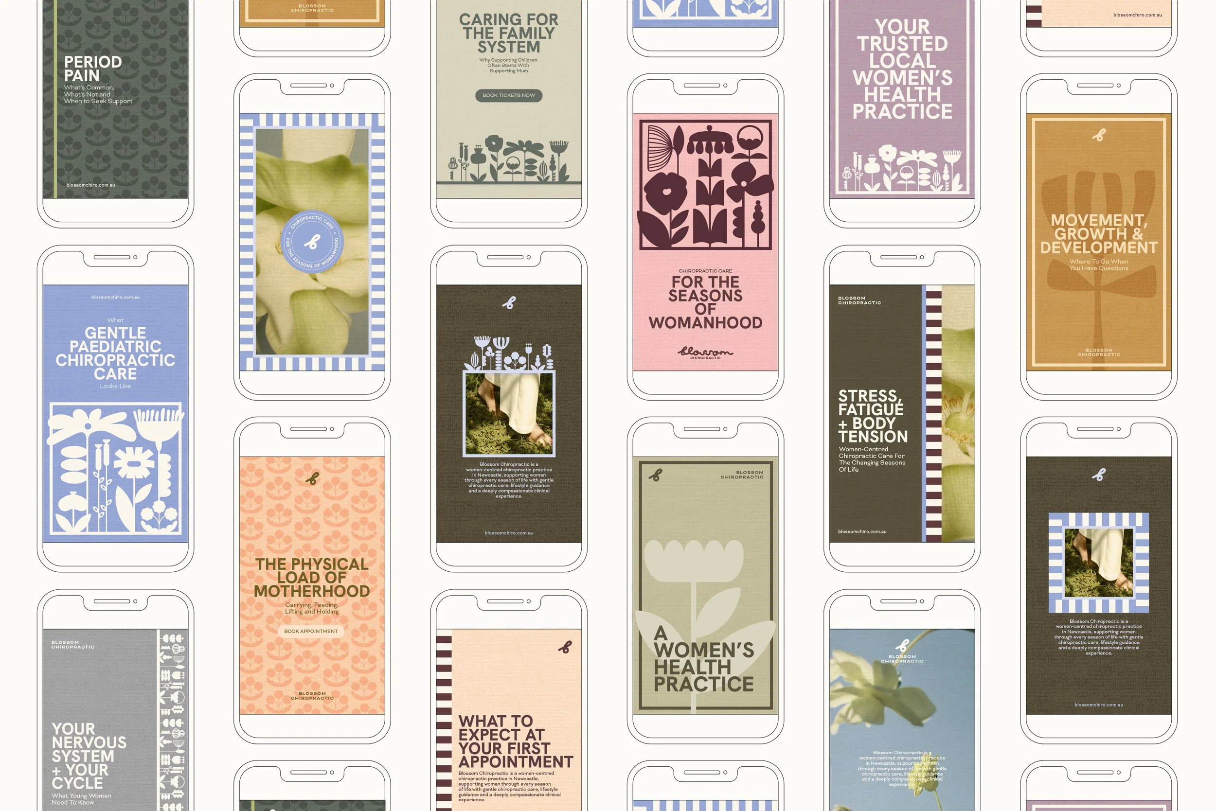
Across digital communication, educational content, printed material and the clinic environment, the same idea continues to surface in different ways. The result isn't a space covered in branding, but a series of cues that consistently reinforce what Blossom is and who it was created for.


4. THE OUTCOME
A new practice launched with a position it could genuinely build from.
Blossom entered the market with more than a polished identity. It had a clear understanding of the audience it wanted to reach, a distinctive position within its category and an organising idea capable of guiding the business beyond launch.
For the seasons of womanhood gives the practice a framework for decisions around services, education, content, partnerships and future growth, while the visual and verbal identity makes that position recognisable across every touchpoint.
Instead of competing as another general chiropractic clinic, Blossom has its own territory - one broad enough to evolve with the practice, but specific enough for the right people to recognise that it was created with their experiences in mind.

5. FINAL THOUGHTS
A blank slate is most valuable when you resist the temptation to start with the logo.
Blossom is a good example of why the earliest stages of a brand project can have the greatest influence on everything that follows.
There was no existing identity to fix and no established positioning to preserve. That gave us the opportunity to step back and ask bigger questions about the business itself: Who could this practice serve particularly well? What was missing from the category? What could it stand for beyond the service it provides?
Finding the idea of the seasons of womanhood gave everything else something to organise around. The name, identity, language, website and physical environment weren't separate creative exercises; they became different expressions of the same strategic thought.
For Meridian, that's the value of beginning with strategy: before deciding how a business should look, finding the idea worth building the business around.