

ERIN DUBÉ KINESIOLOGY
Creating a brand that makes an unfamiliar practice feel easier to understand.
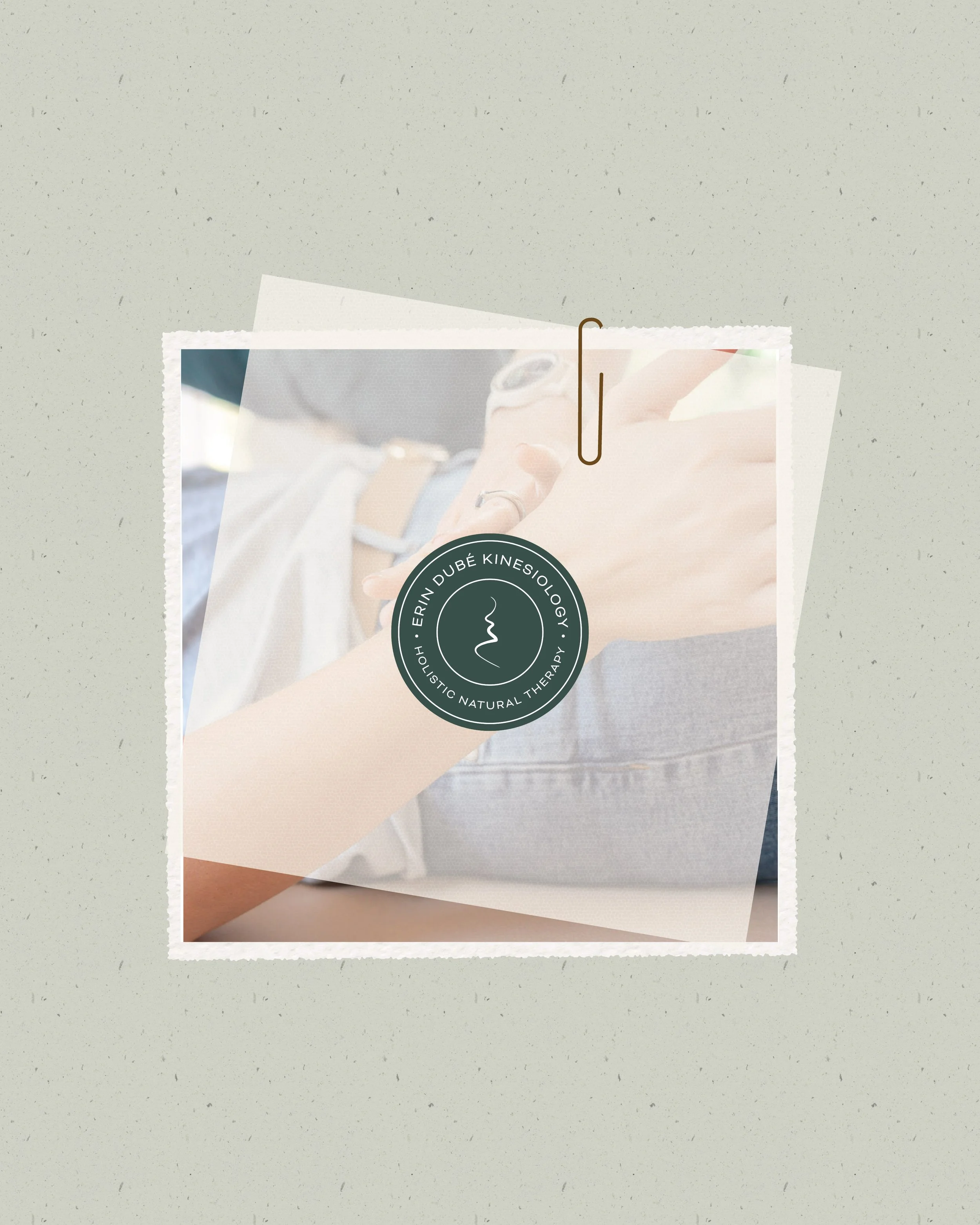
Erin Dube Kinesiology is a holistic wellness practice supporting people through stress, emotional wellbeing, nervous system regulation and personal change.
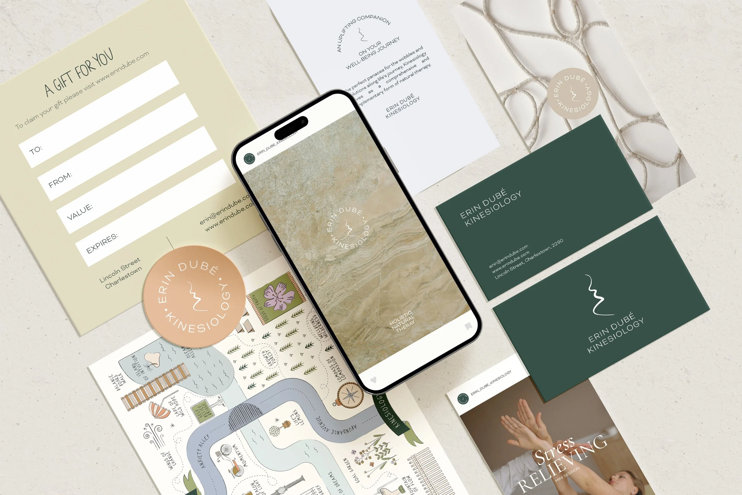
For many potential clients, however, kinesiology can be difficult to understand before they experience it. Meridian developed a brand identity and illustrated visual language that could make the practice feel less abstract - translating Erin’s gentle, whole-person approach into something people could see, understand and feel comfortable stepping into.
1. THE CHALLENGE
Giving form to something that is largely felt rather than seen.
Unlike a physical product or service with an obvious outcome, much of Erin’s work happens beneath the surface. Kinesiology considers patterns of stress, emotion, energy and the body - making the experience deeply personal but difficult to communicate visually.
The challenge was to create an identity that felt credible without becoming clinical, and warm without falling into the familiar visual language of alternative wellness.
More importantly, the brand needed to help people understand what working with Erin might actually feel like: supported rather than fixed, curious rather than prescriptive, and gently guided through a process of understanding themselves more deeply.
2. THE APPROACH
Turning the client journey into a visual language.
Rather than trying to visually explain kinesiology itself, the creative direction focused on the experience surrounding it - movement, exploration, connection and gradual change.
A muted, nature-inspired palette and soft typography established a sense of calm, while organic forms and illustration brought warmth and humanity into the identity.
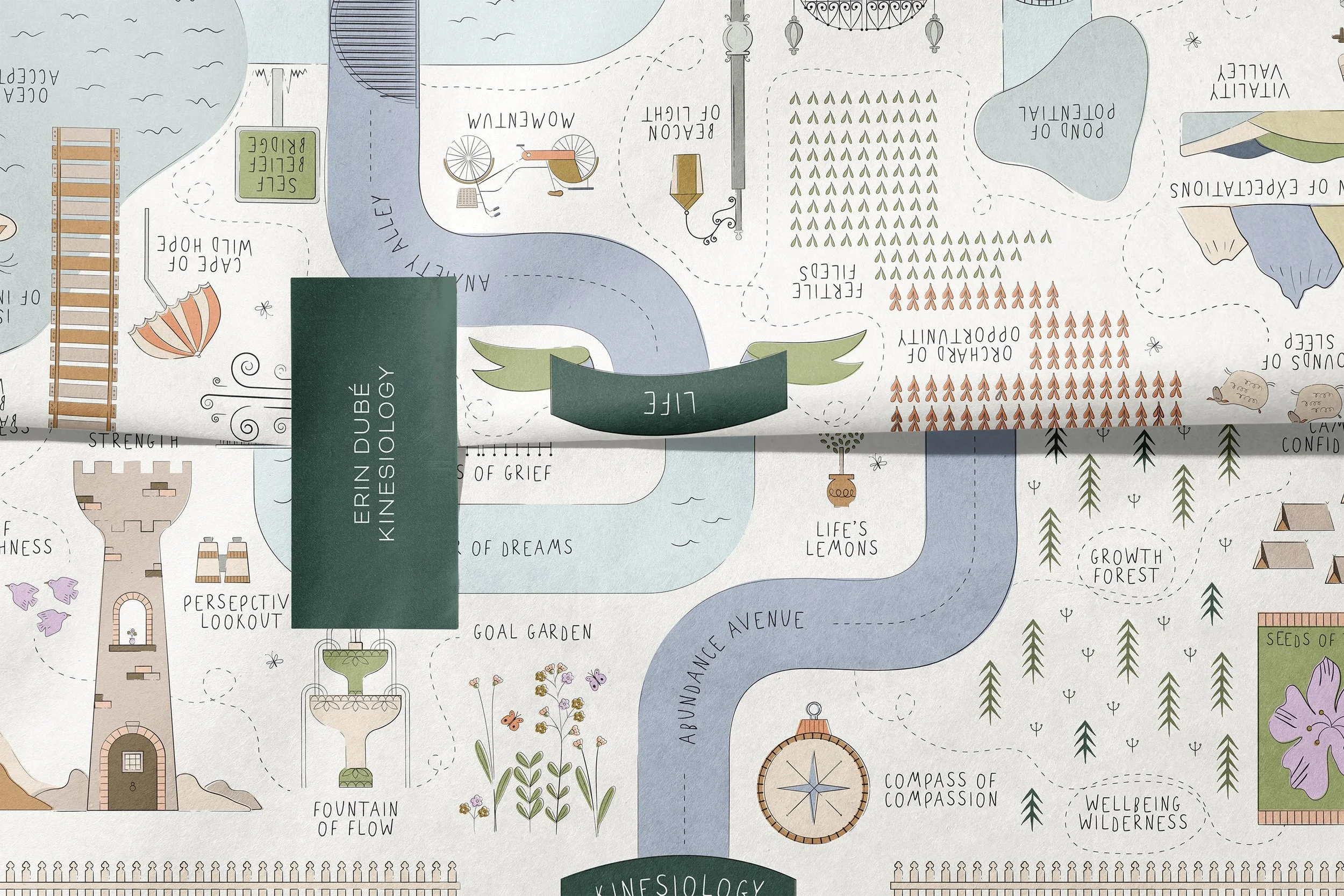
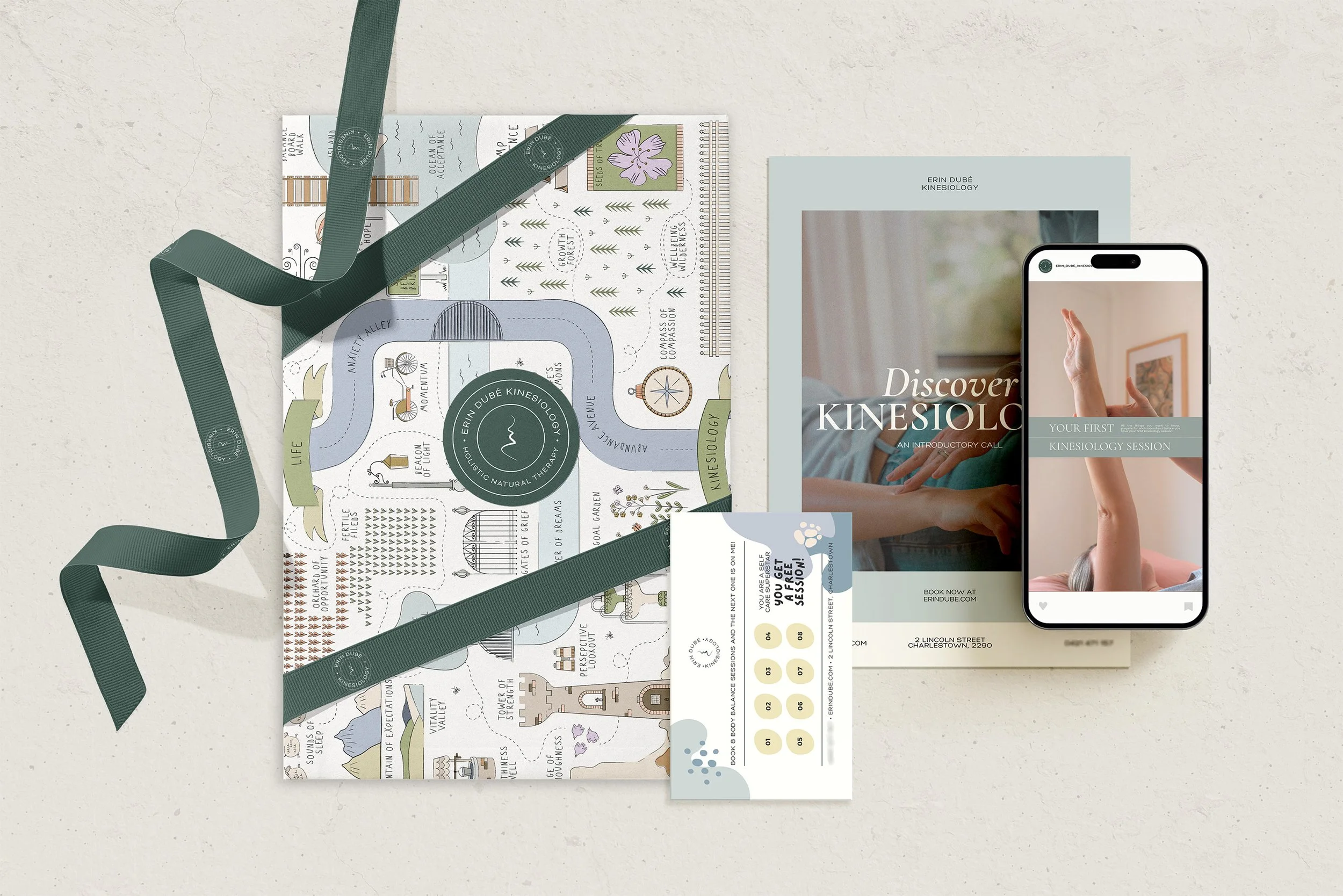
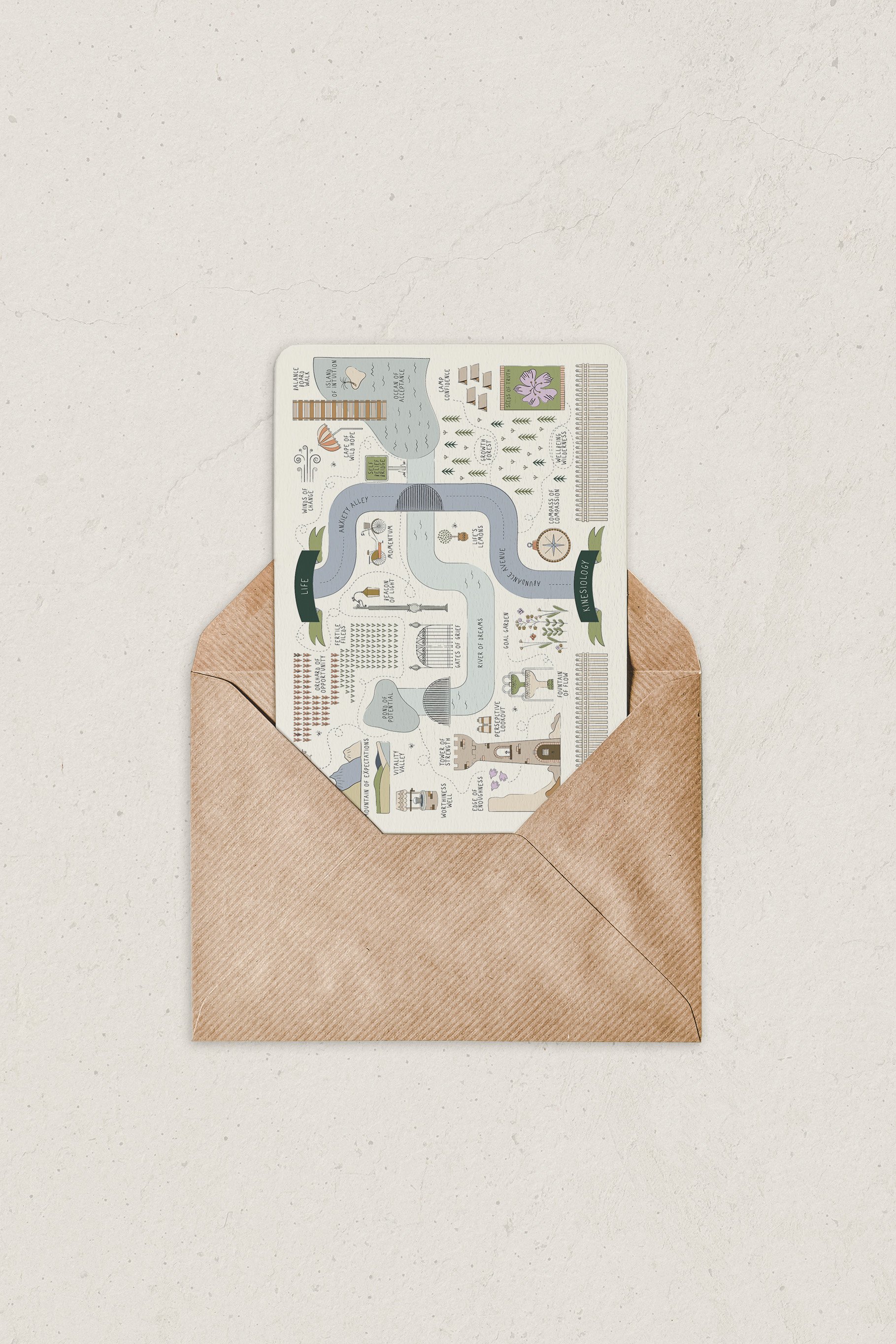
At the centre of the visual language was a custom illustrated map. Instead of presenting wellbeing as a straight path from problem to solution, the map imagined it as a landscape to move through - with different paths, pauses, discoveries and points of connection along the way.
It gave an intangible process a physical metaphor and created a distinctive storytelling device that could extend far beyond the logo itself.
3. THE EXPERIENCE
Creating continuity between the brand, the journey and the physical space.
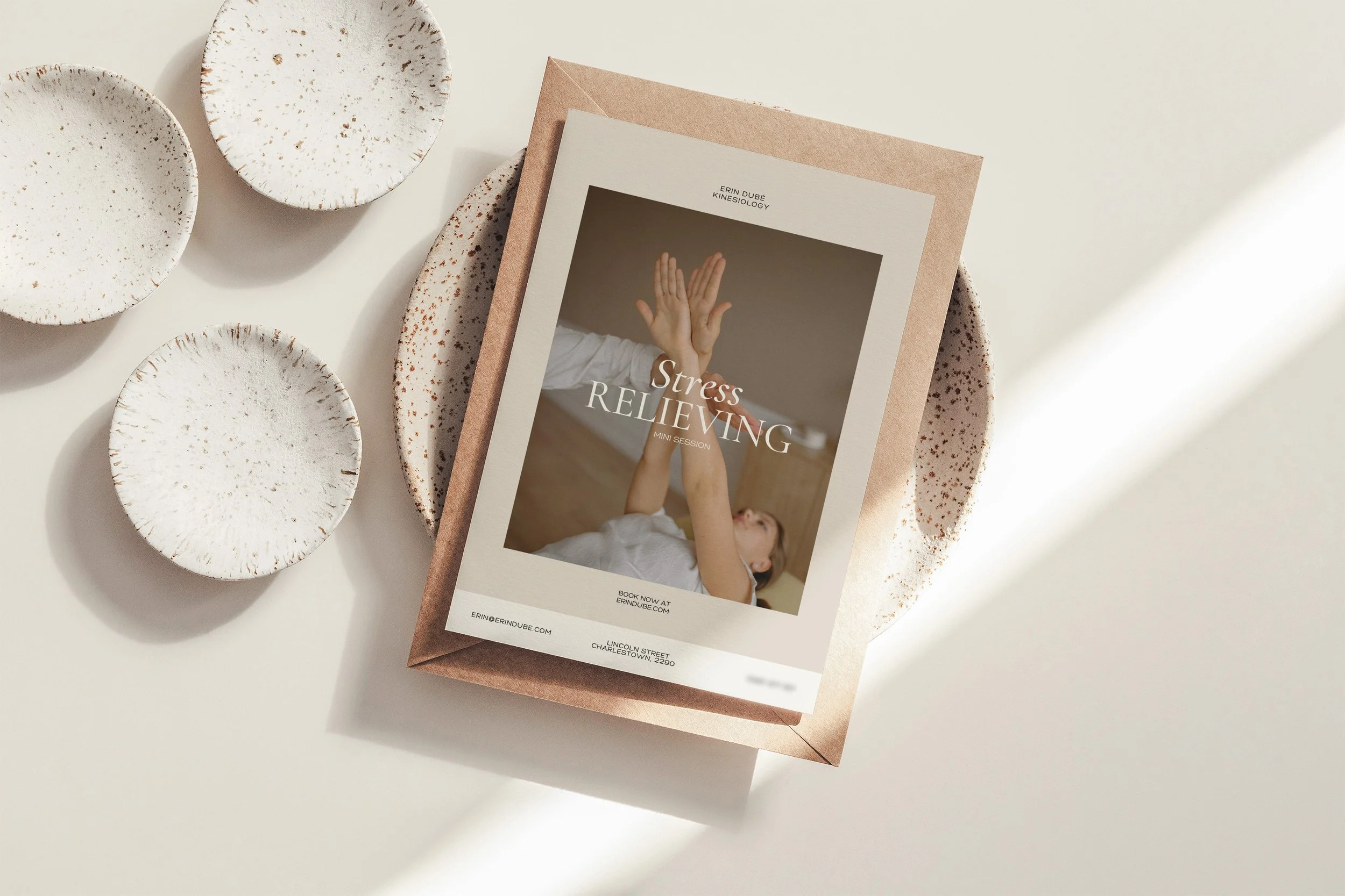
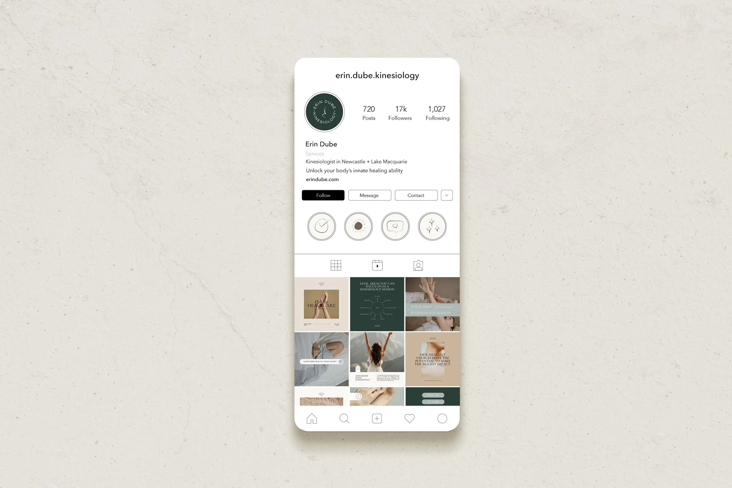
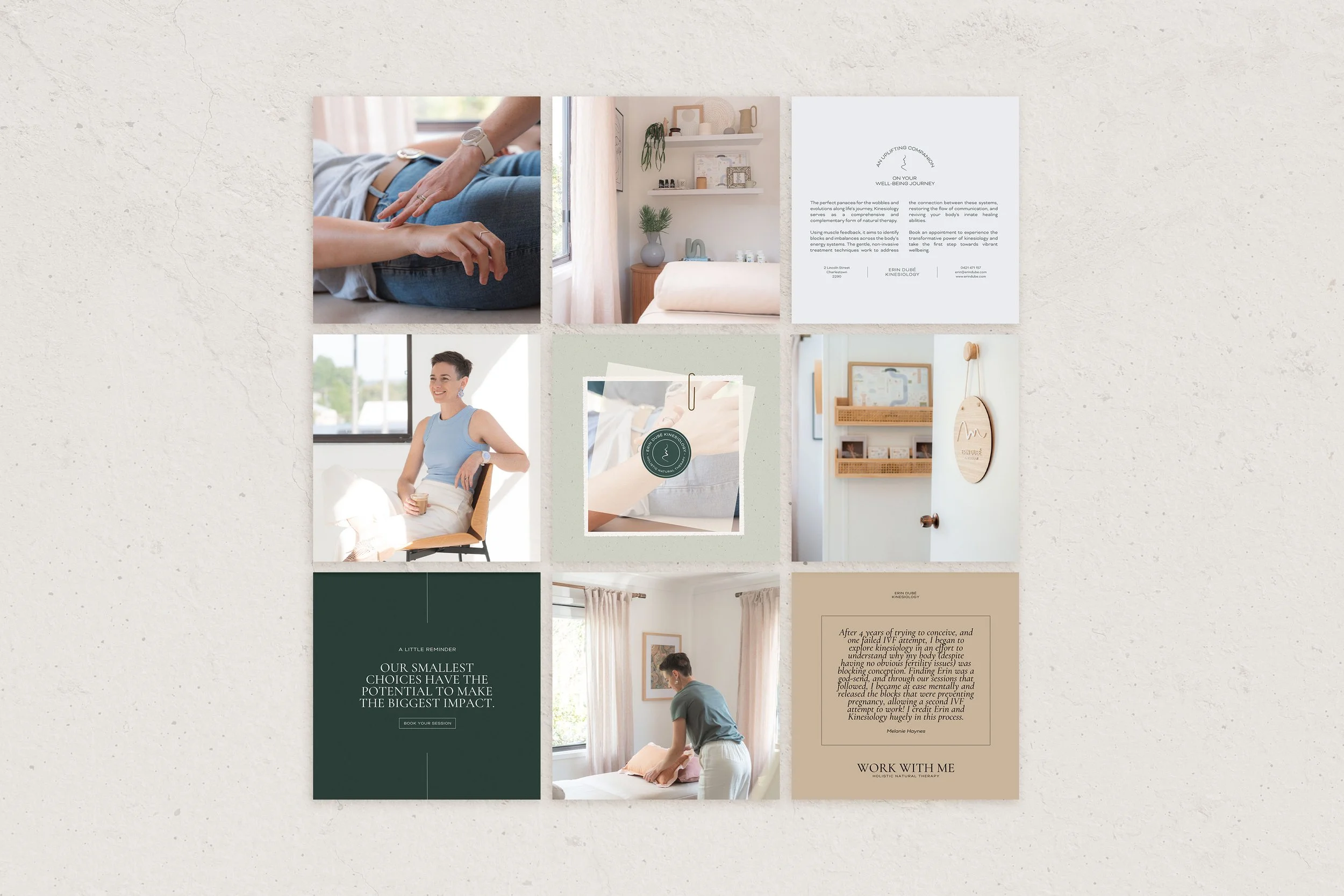
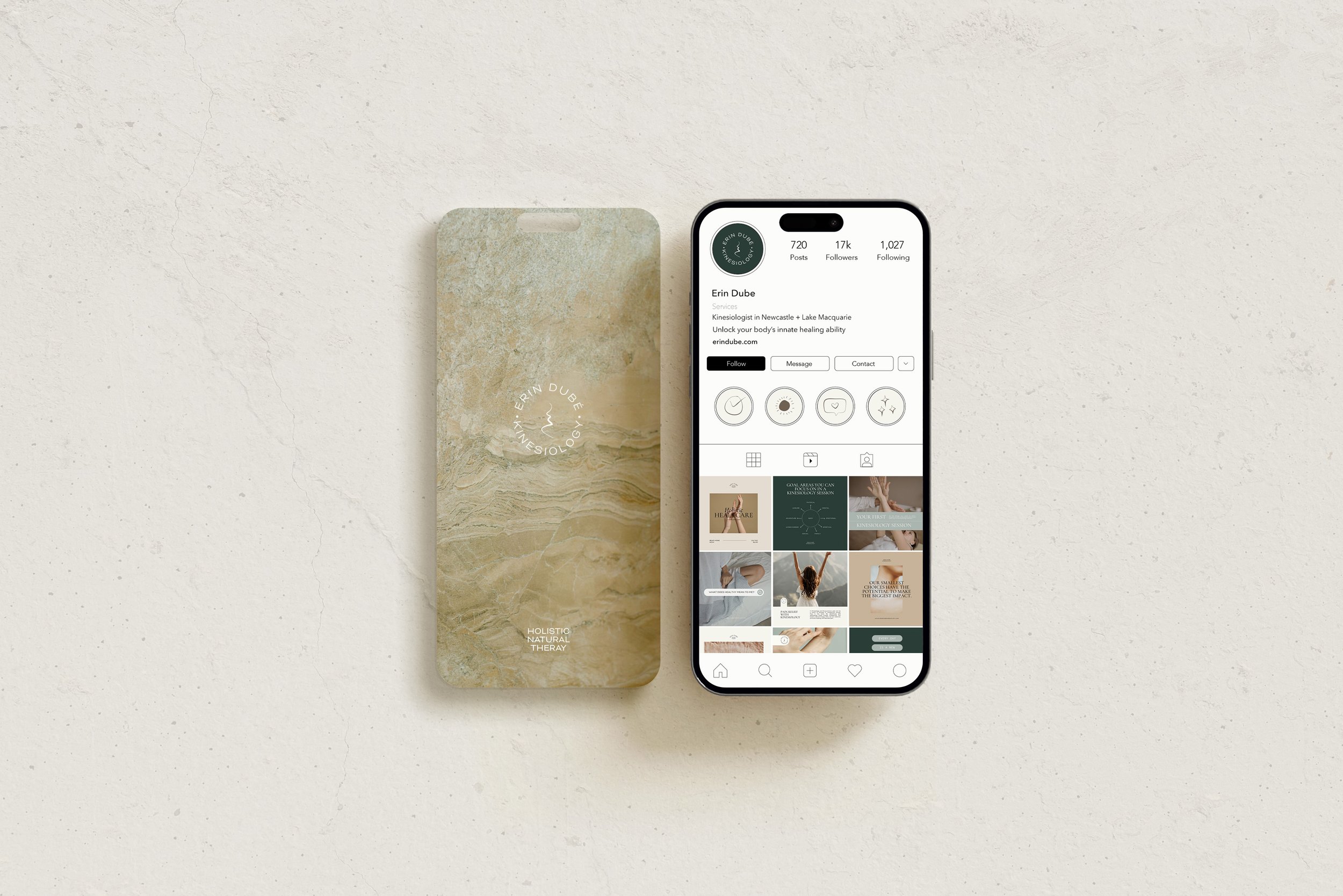
The identity was designed to move across every part of the client experience - from digital communication and social content through to printed materials and the practice environment itself.
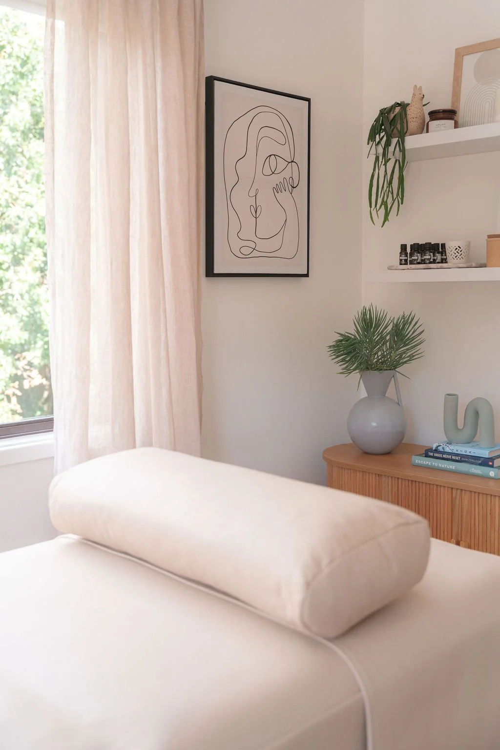
The same principles established through the brand informed the physical space: natural materials, gentle colour, tactile texture and considered details creating an environment that felt calm and grounded without becoming overly styled or clinical.
Illustration added another layer of storytelling throughout the experience, giving Erin a way to communicate ideas that can otherwise feel complex or abstract.
Together, these elements created a sense of continuity. The experience of discovering Erin online, arriving at the practice and engaging with her work all felt like part of the same world.
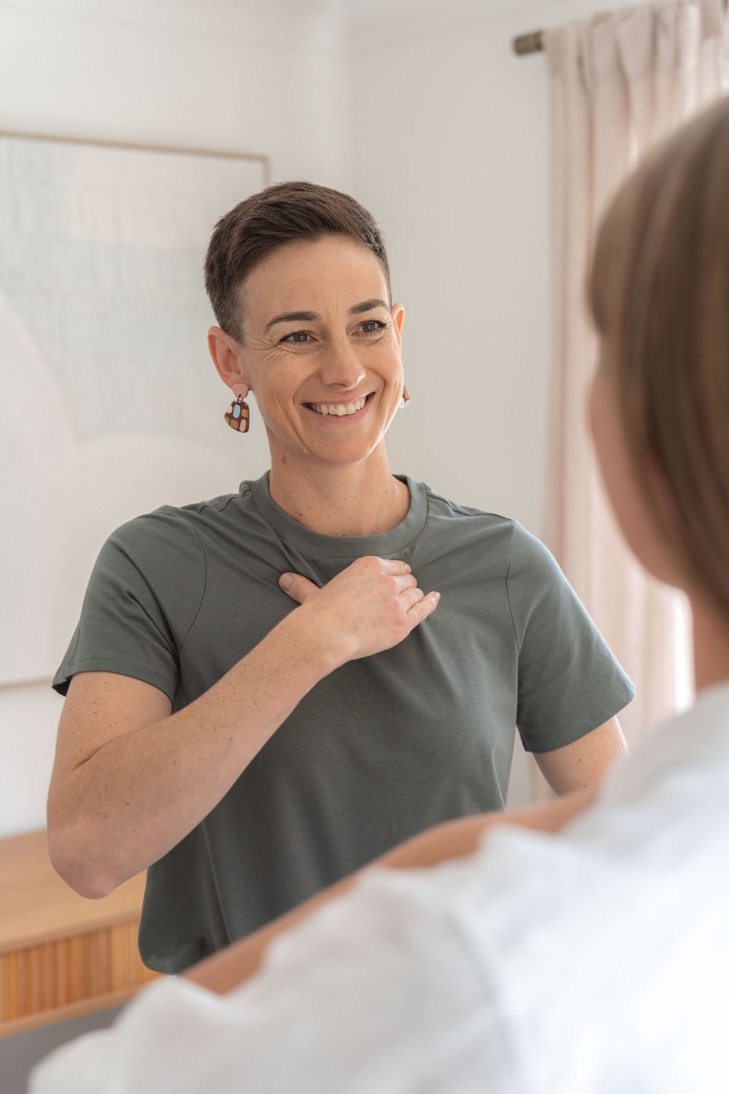
4. THE OUTCOME
A brand that helps people feel comfortable entering the unknown.
The resulting identity gives Erin a distinctive and flexible way to communicate a practice that can otherwise be difficult to explain.
Rather than relying on conventional wellness imagery, the brand creates its own language around exploration, connection and change - helping potential clients form an emotional understanding of the experience before needing to understand every aspect of kinesiology itself.
The result is a brand that feels calm and considered, but importantly, still human: one that supports Erin’s expertise while allowing the warmth and individuality of her practice to remain at its centre.
5. FINAL THOUGHTS
This project became less about finding the perfect visual representation of kinesiology and more about asking what someone needs to feel before they are willing to explore something unfamiliar.
The illustrated journey gave us a way to turn an abstract experience into a world people could recognise themselves within - while the wider identity and environment carried that feeling through every interaction.
For Meridian, it demonstrates the potential of brand storytelling when the thing being communicated cannot easily be photographed, packaged or explained: design can create the bridge between understanding something intellectually and feeling ready to experience it.