

THE FAMILY CHIRO
Turning an established family practice into a brand that feels as welcoming as the care it provides.
The Family Chiro is a long-established chiropractic practice in Newcastle, caring for generations of local families across different ages and stages of life.
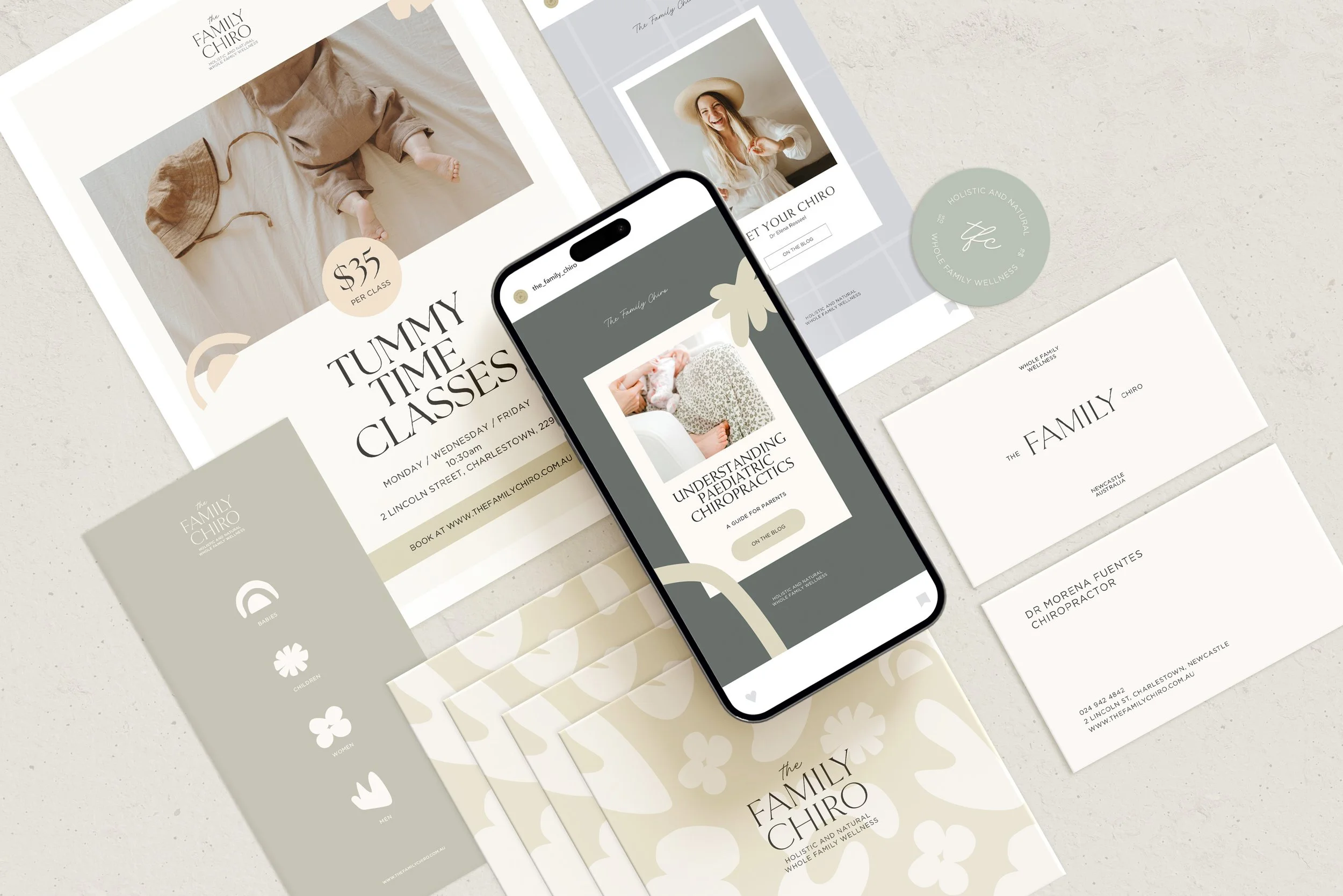
The project began with the brand identity, but quickly revealed a larger opportunity. The experience of the practice wasn't confined to a logo or website. It began before a client arrived, continued through the front door, reception and treatment rooms, and extended into the information and communication they took home with them.
The project became about bringing those pieces together - creating a clearer, warmer and more recognisable expression of The Family Chiro across both its brand and physical environment.
1. THE CHALLENGE
Balancing clinical credibility with warmth and accessibility.
The Family Chiro didn't need to become a different business. It already had something far more valuable than a new brand could manufacture: an established reputation, long-standing relationships and a genuine place within its local community.
The challenge was that the experience surrounding that care didn't always communicate those qualities as clearly as the people within the practice did.
Across digital, print and the clinic itself, there was an opportunity to create greater connection between the different ways clients encountered the business. At the same time, the identity needed to balance the credibility expected of a healthcare practice with the warmth and accessibility of a place designed for entire families.
2. THE APPROACH
Building the identity from the feeling the practice wanted people to carry with them.
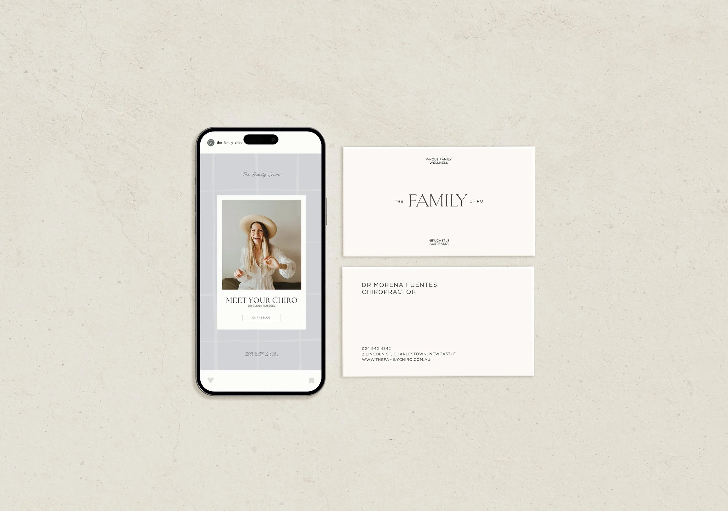
Rather than beginning with individual design elements, the visual direction was developed around the experience of being cared for: calm, approachable, reassuring and human.
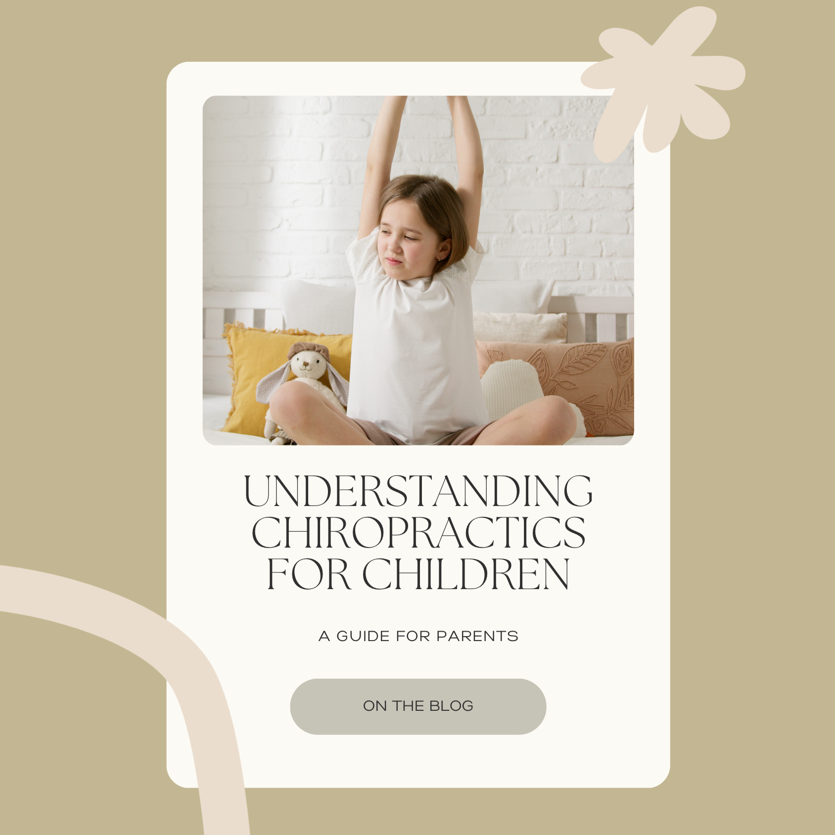
A soft, natural colour palette moves away from the colder visual language often associated with healthcare, while considered typography and organic graphic forms create a sense of warmth without becoming overly playful or informal. The identity was deliberately simple enough to remain clear and professional, but flexible enough to feel at home across family-focused communication.
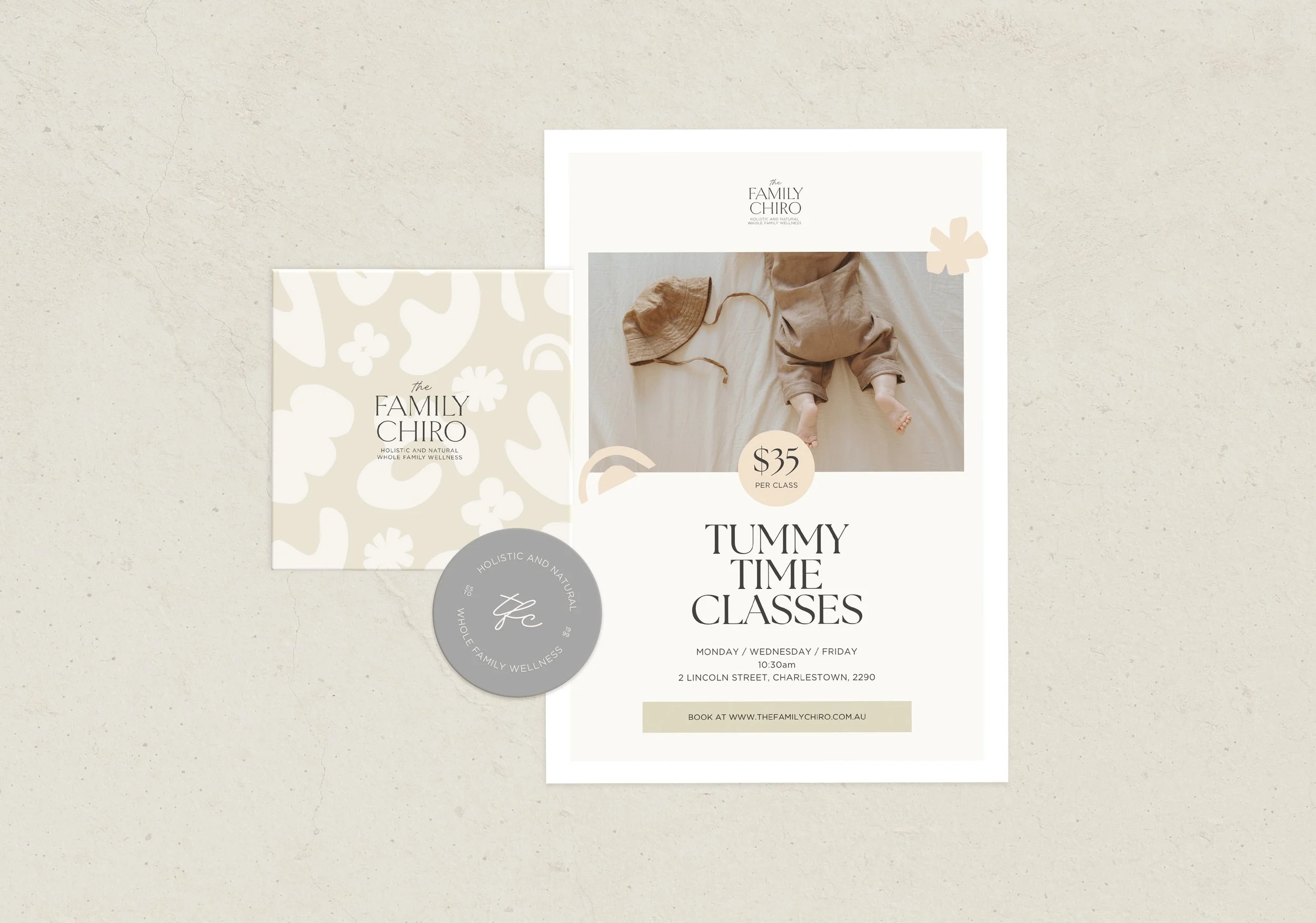
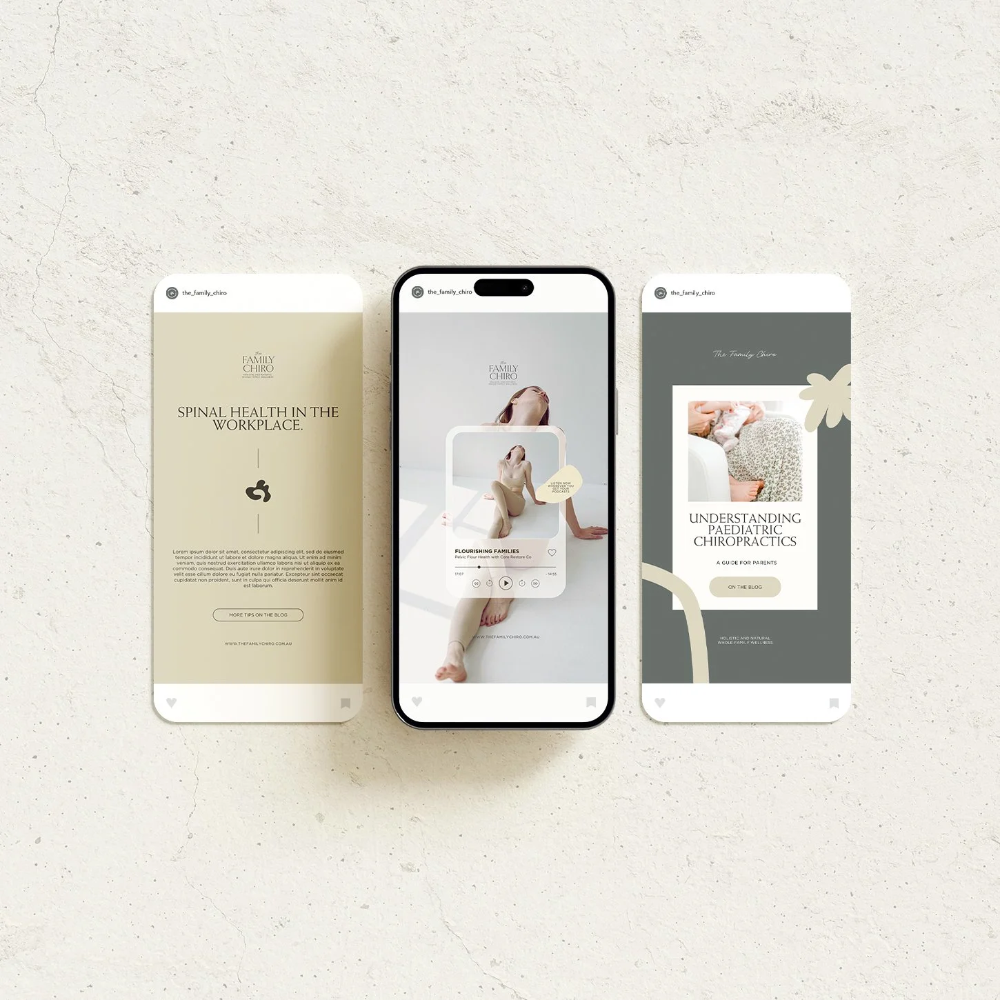
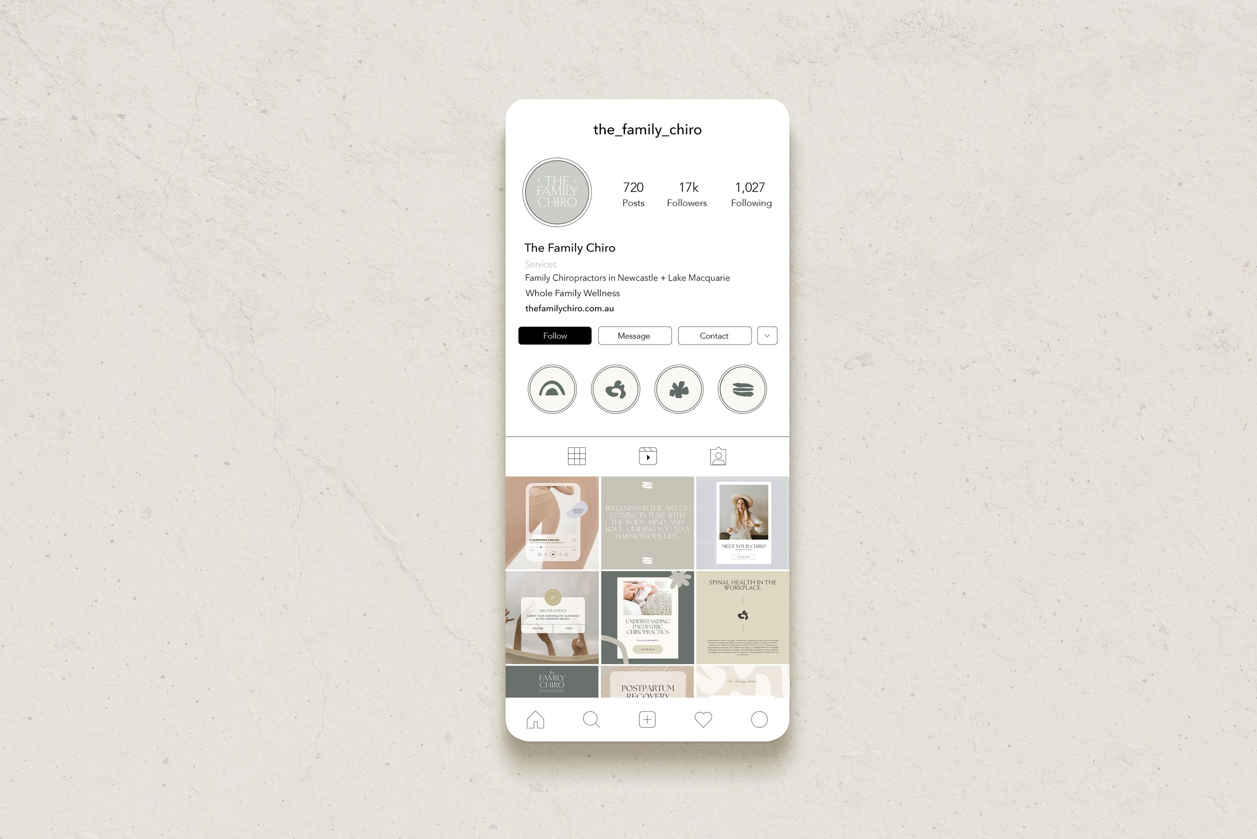
From the beginning, the brand was considered as a system rather than a logo. Colour, typography, graphic elements, photography and layout were designed to work together, giving the practice a recognisable visual language that could be carried across very different applications.
That same thinking then provided the foundation for decisions beyond the page - allowing the brand to begin shaping the physical experience of the clinic too.
3. THE EXPERIENCE
Carrying the brand beyond the screen and into the everyday experience of care.
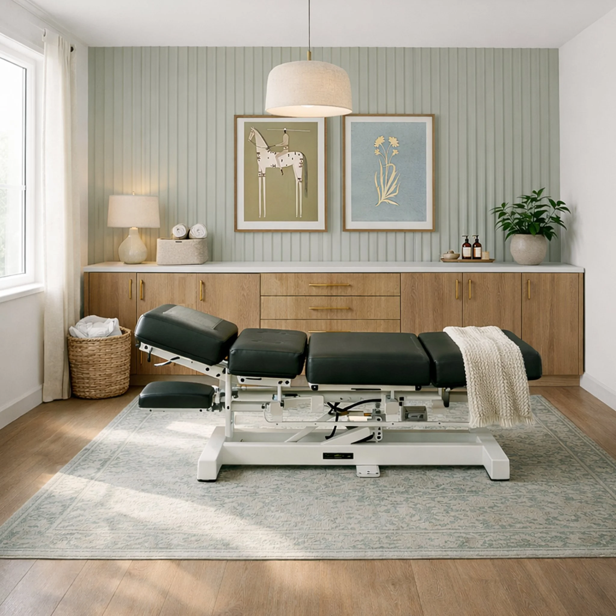
For a service built around face-to-face care, the physical environment is one of the most important expressions of the brand.
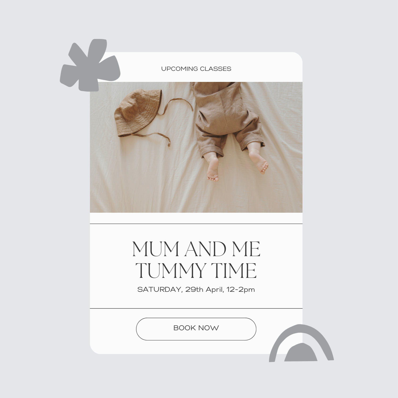
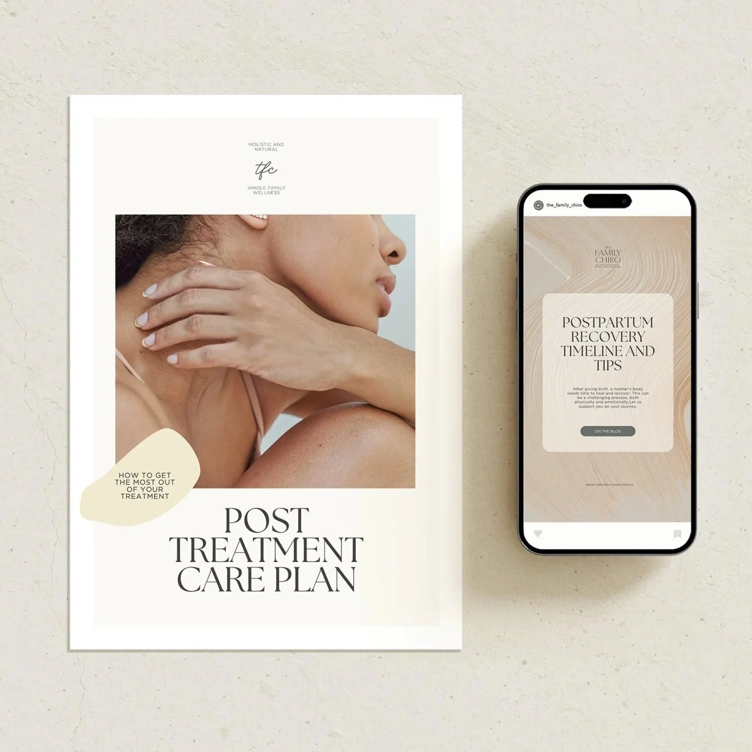
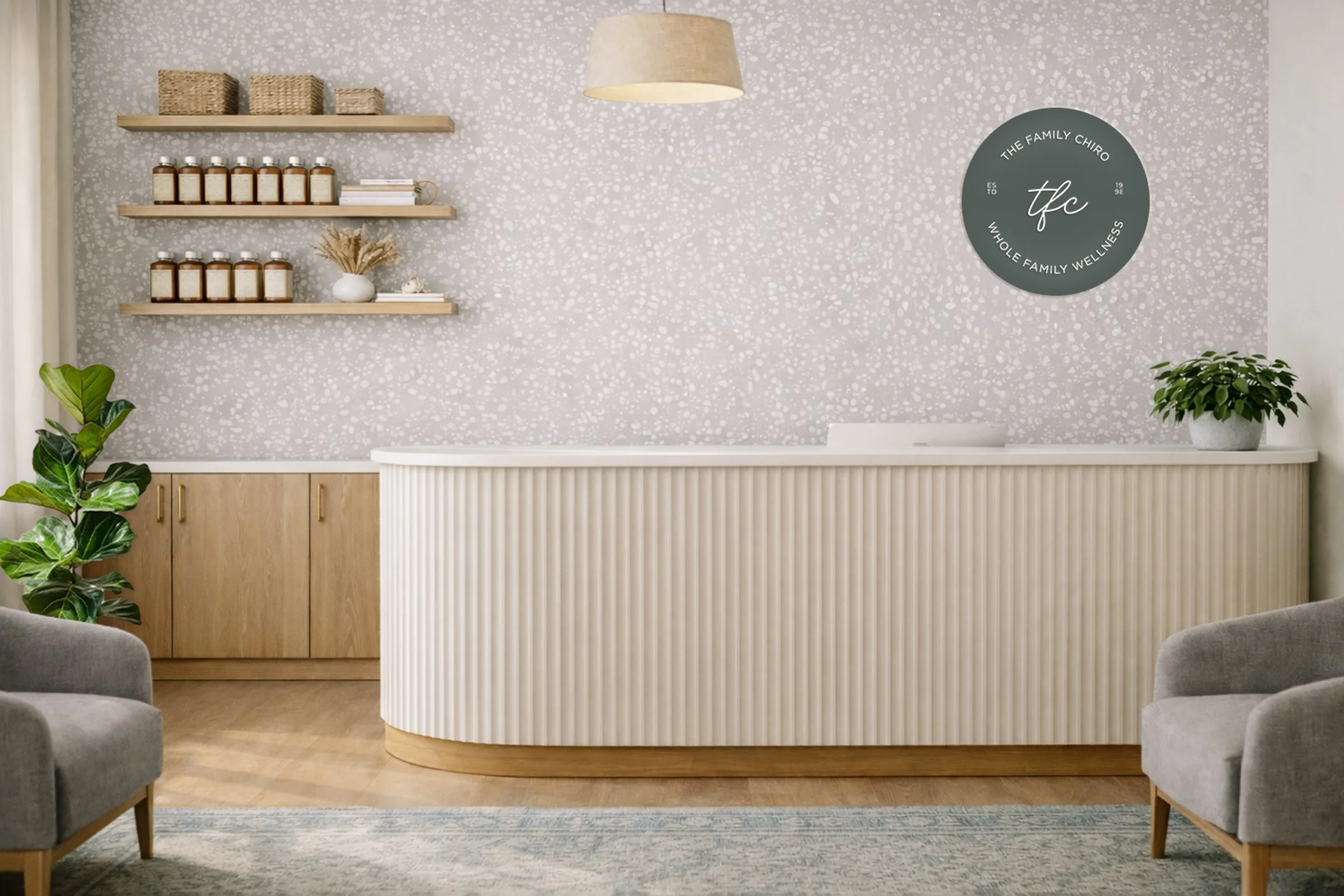
The visual language was extended through the clinic so the experience clients encountered online could continue when they arrived in person. Signage, reception areas, treatment spaces and environmental details were considered alongside digital content, printed materials, patient communication and supporting brand collateral.
Rather than treating each of these as separate design tasks, they became parts of the same experience.
The result is a system where the quieter details do much of the work. Familiar colours, repeated forms, considered imagery and consistent communication create small moments of recognition throughout the client journey.
Together, they help the practice feel less like a collection of branded touchpoints and more like one connected place.
4. THE OUTCOME
A brand system designed to support the practice in the real world, not simply represent it.
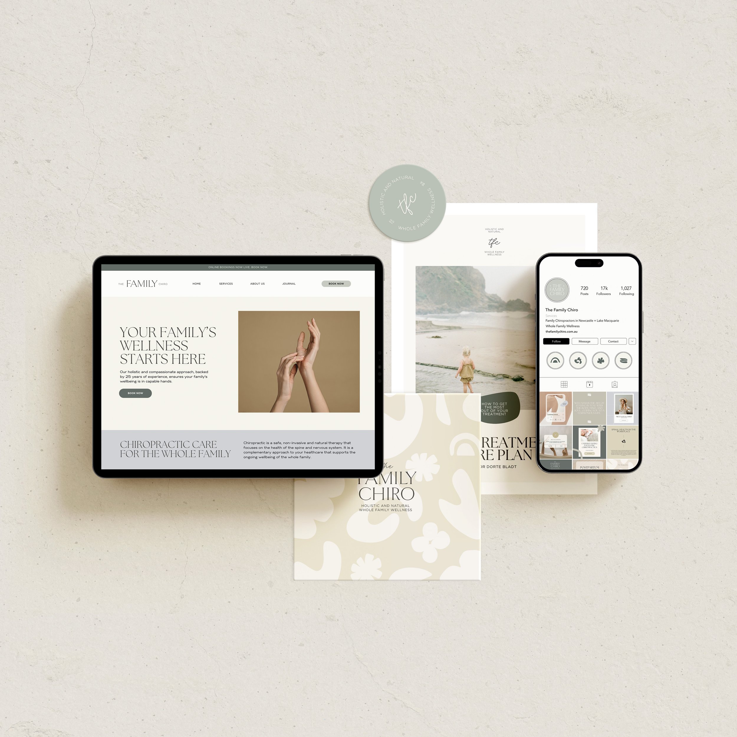
The completed identity gave The Family Chiro a clearer and more cohesive way to communicate while preserving the warmth and familiarity that had been built over many years.
It created consistency across the practice without requiring every application to look identical, and provided a visual framework that could continue to be used as the business evolved.
More importantly, the project demonstrated what becomes possible when brand and environment are considered together. The website, communication materials and physical clinic no longer need to tell separate stories. Each can reinforce the same sense of care, familiarity and trust.
The result is an experience that feels considered without feeling designed for design's sake - supporting the relationships at the heart of the practice rather than competing with them.
5. FINAL THOUGHTS
The strongest brands aren't only recognised. They're experienced.
The Family Chiro reinforced something that has become increasingly important in the way I approach brand design: people rarely experience a business through one perfectly composed touchpoint.
They experience it in parts - a website visited late at night, a sign at the entrance, the feeling of a waiting room, an appointment reminder, a conversation, a printed piece taken home.
Branding creates the greatest value when those fragments begin to belong to the same story.
For The Family Chiro, that didn't mean covering every surface in branding. It meant understanding where design could quietly support the experience - creating familiarity, reducing friction and making the care already present within the business easier to feel.
That space between identity and experience is often where the most meaningful design decisions are made.