

FRANKIE MAE
Designing an identity for a brand that lives through ideas, content and conversation.
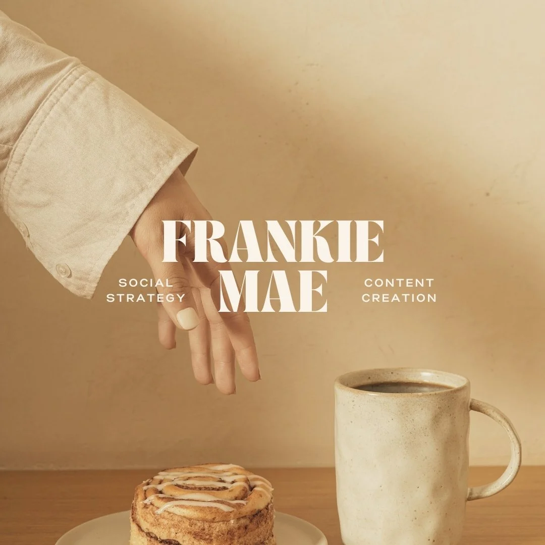
Frankie Mae is a content and strategy studio helping businesses build more thoughtful, connection-led online presences.
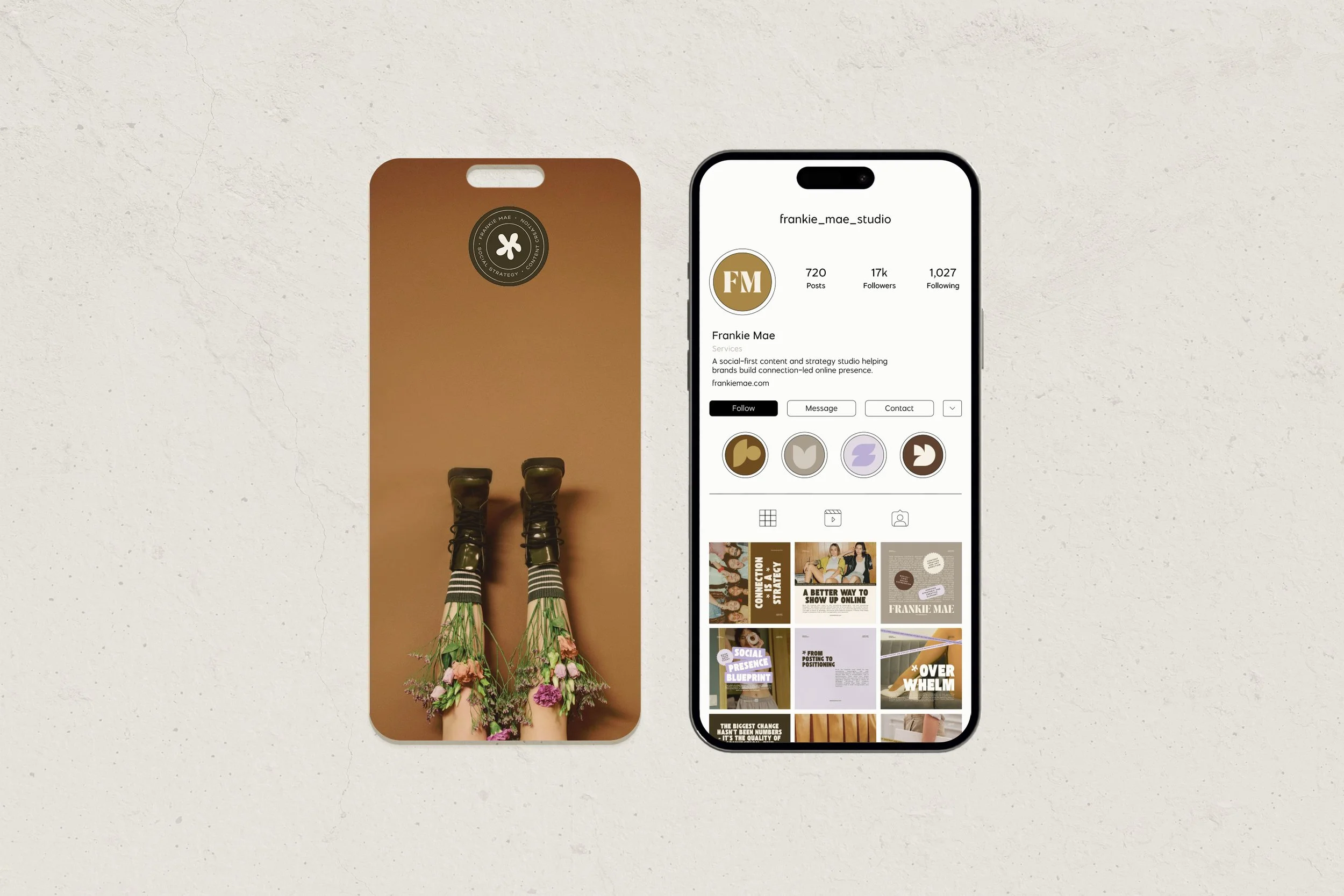
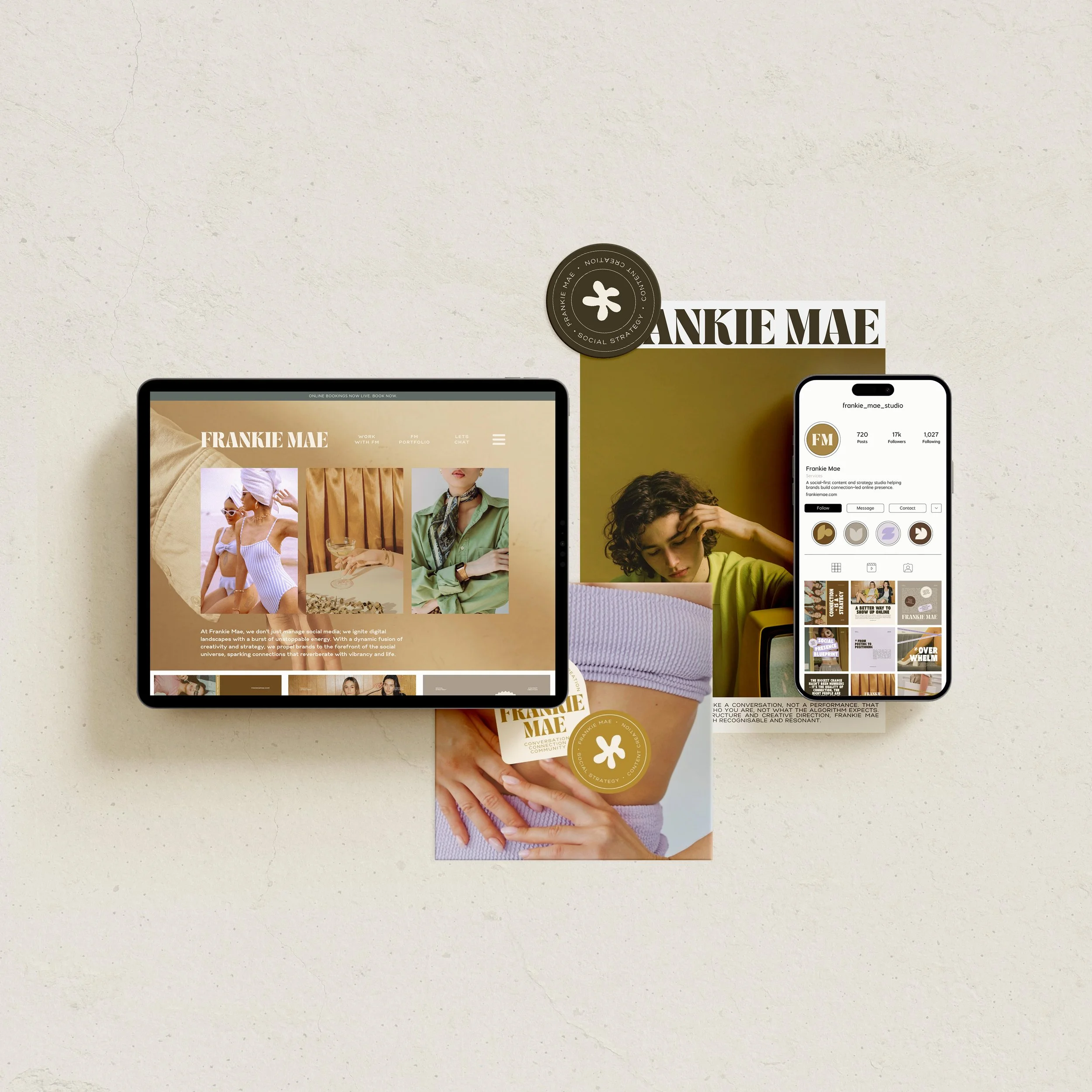
Unlike a brand whose identity is primarily encountered through packaging, a physical space or traditional collateral, Frankie Mae lives largely in motion. Its ideas are its product, and social media, conversation and digital content are where much of the relationship with its audience is built.
The project became an exploration of what happens when content isn't treated as something added to a brand after the identity has been designed, but as one of the foundations the identity is built around.
1. THE CHALLENGE
Creating consistency for a brand that needs to keep changing.
Content-led businesses present an interesting design challenge. They need to be recognisable, but they also need enough freedom to communicate different ideas, respond to conversations and produce new material constantly.
Too rigid, and the identity quickly becomes repetitive. Too flexible, and the brand begins to disappear behind the content.
For Frankie Mae, there was another layer to solve. The studio advocates for a more thoughtful approach to social media - one built around clarity, conversation and genuine connection rather than simply producing more content for the sake of visibility. The identity needed to embody that philosophy rather than contradict it.
2. THE APPROACH
Building a visual system around communication rather than decoration.
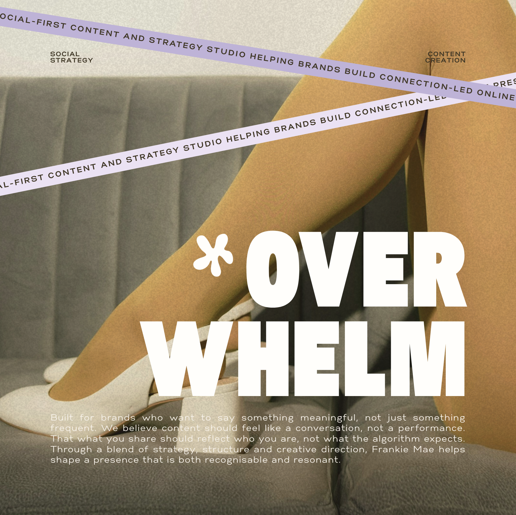
The starting point was not to create an endless library of social templates. It was to establish a small number of recognisable visual principles that could generate variety.
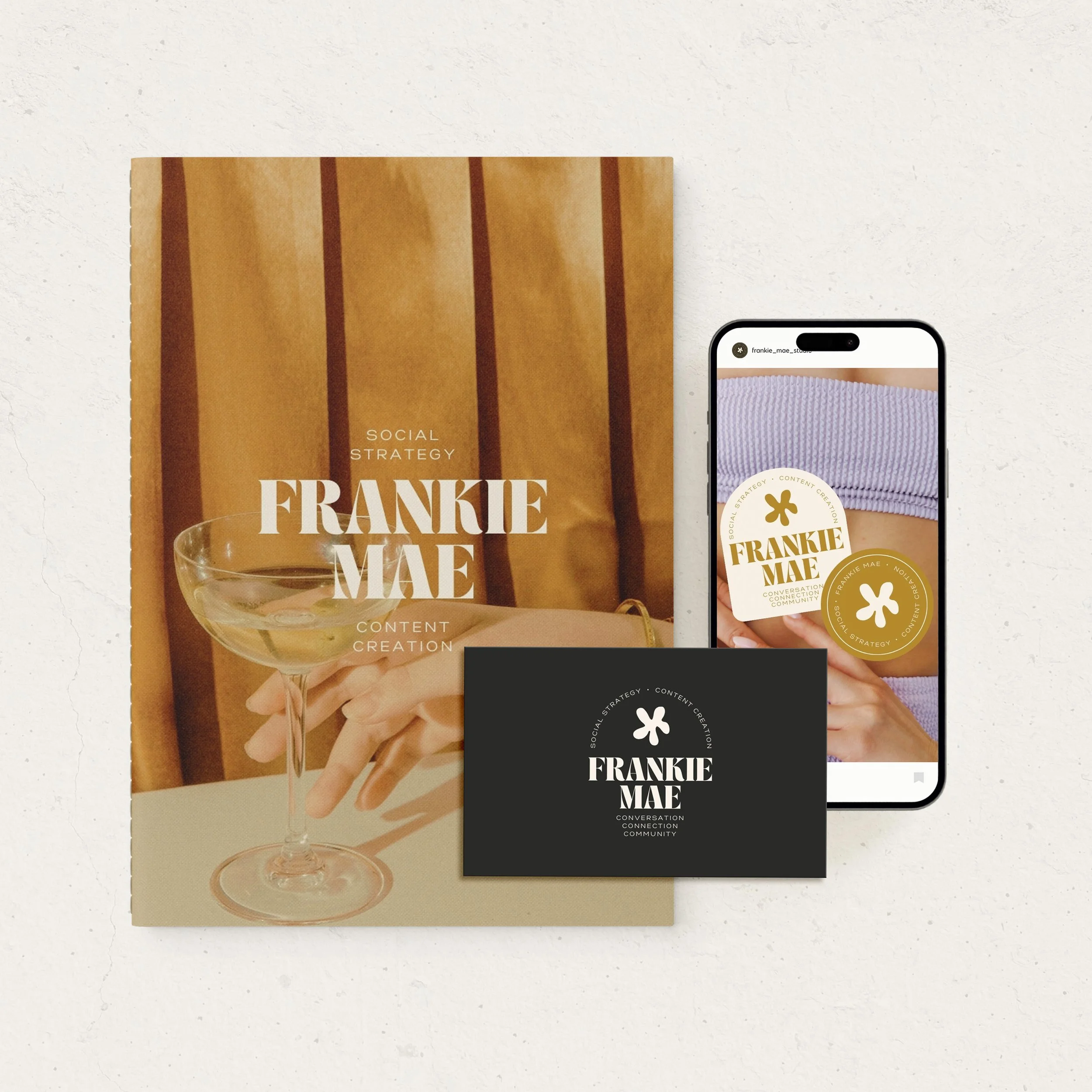
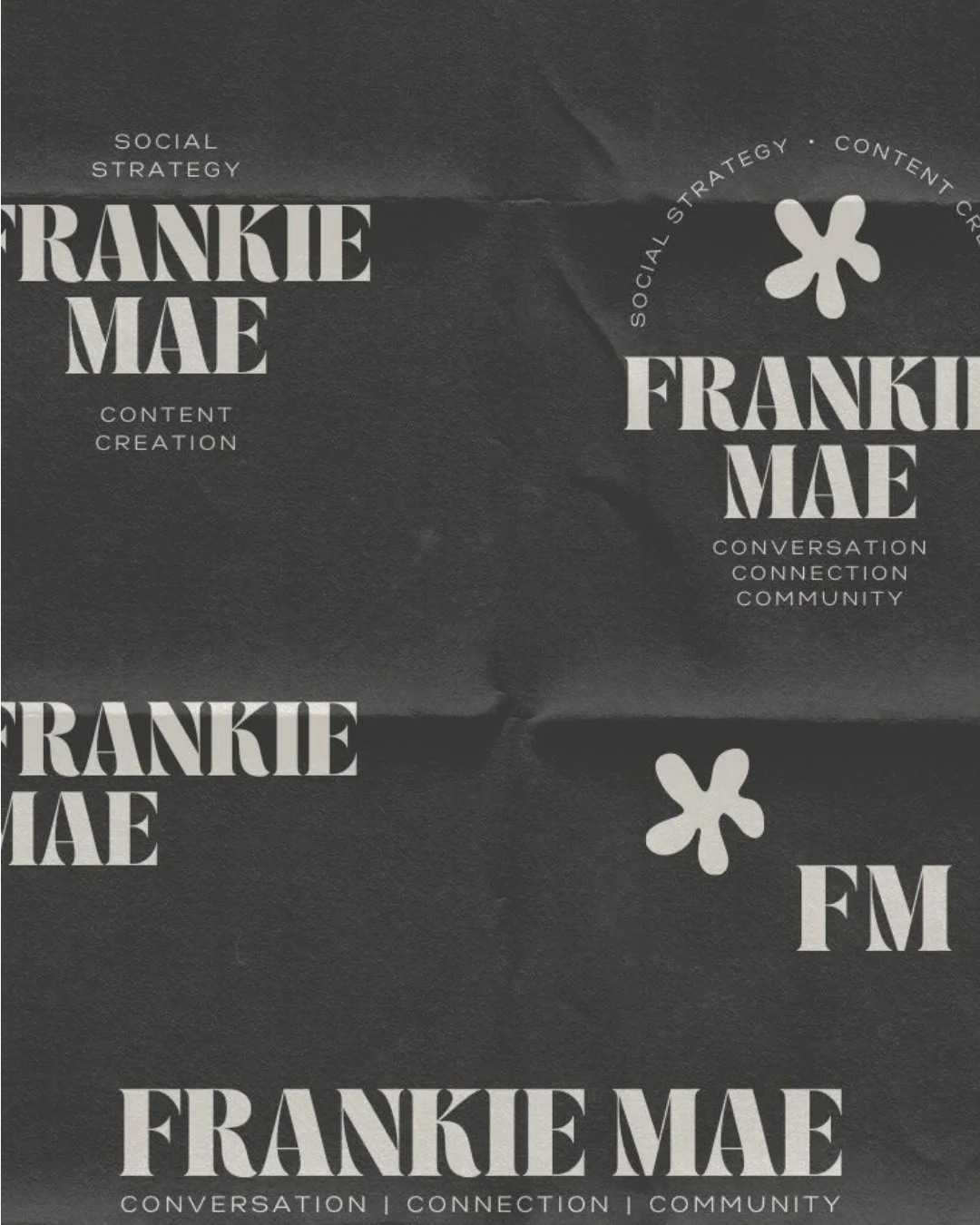
Typography became one of the strongest elements of the identity, allowing language and ideas to take centre stage. A restrained palette creates continuity, while shifts in scale, composition, photography and layout give the system enough movement to accommodate different kinds of communication.
Rather than asking every post to look the same, the identity establishes a recognisable rhythm.
This creates a visual language that can hold a sharp strategic observation one day, a client story the next, and something more conversational after that - without losing the thread connecting them.
The result is less about designing individual pieces of content and more about designing the conditions in which content can continue to be created.

3. THE EXPERIENCE
Turning everyday communication into the place where the brand comes alive.
For Frankie Mae, social media isn't simply a marketing channel sitting outside the brand. It is one of its most active environments.
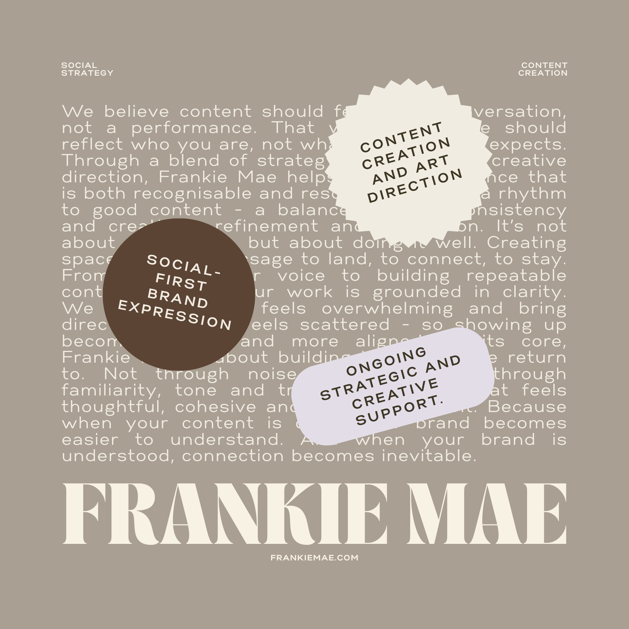
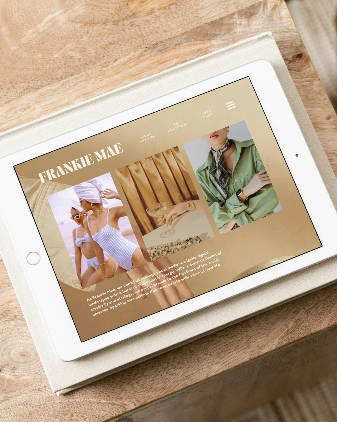
The identity was therefore designed to move naturally between posts, stories, educational content, client reflections, digital touchpoints and longer-form communication. Messaging and visual structure work together so the brand can shift between teaching, questioning, reflecting and selling without each mode requiring an entirely new visual treatment.
Small recurring details create recognition, while variation keeps the experience human and responsive. Over time, those individual moments begin to accumulate into something larger: a distinctive point of view, a familiar visual rhythm and a sense that there is a real person and philosophy behind the content. That ongoing relationship becomes the brand experience.

5. THE OUTCOME
A brand system with enough structure to be recognised and enough freedom to stay interesting.
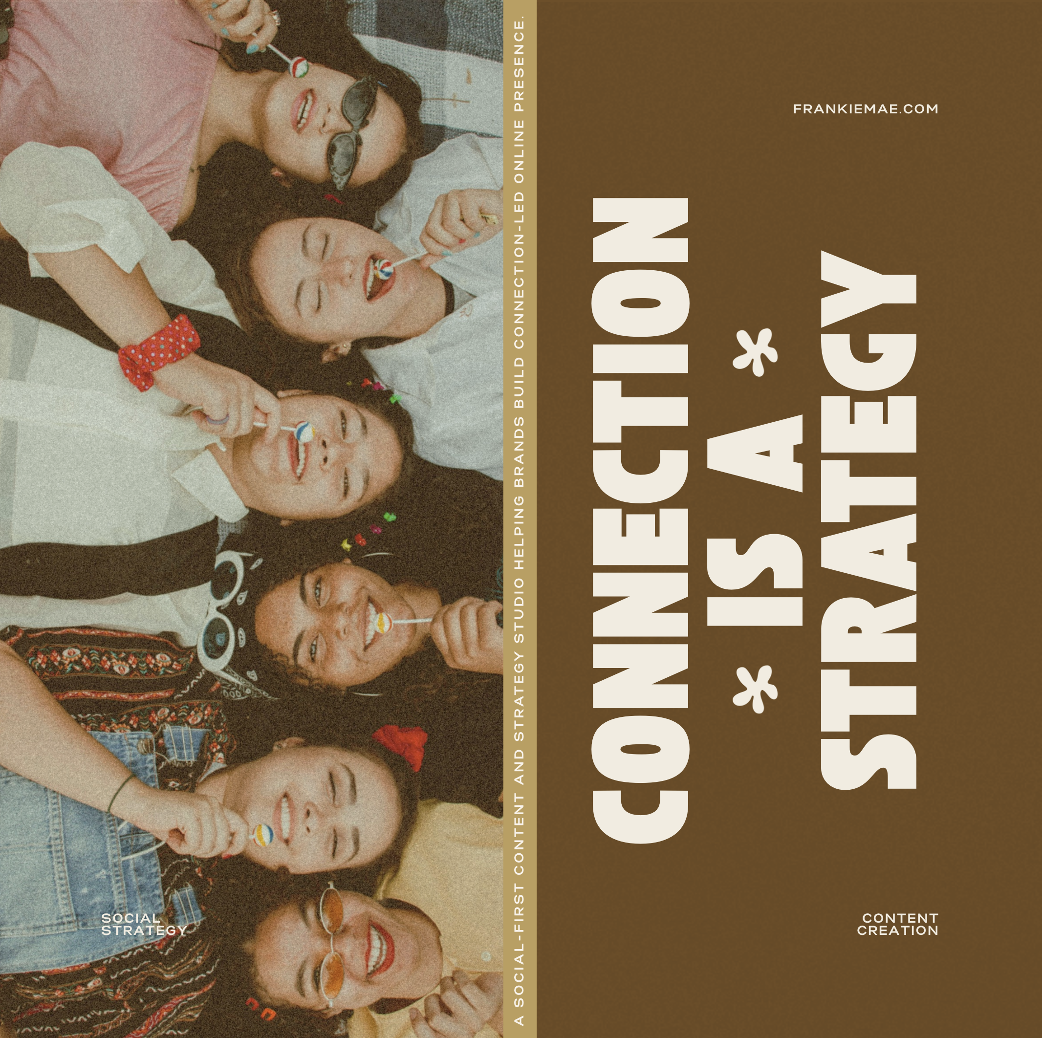
The completed identity gives Frankie Mae a framework for showing up consistently without turning content creation into an exercise in filling templates. It provides clear visual guardrails while leaving room for ideas, personality and conversation to lead - supporting the very approach to content the studio advocates for its clients.
Rather than relying on a logo to create recognition, familiarity is built through the cumulative effect of typography, tone, composition, imagery and repeated visual cues. The result is an identity designed not simply to launch well, but to keep working through hundreds of small interactions as the business grows.
5. FINAL THOUGHT
Sometimes the most important brand application isn't an application at all. It's a behaviour.
Frankie Mae challenged the idea that brand consistency means making everything look the same. For a business built around communication, a successful identity needs to create recognition without limiting what can be said. It needs rules, but it also needs room for spontaneity, relevance and personality. That distinction has become increasingly important in the way I think about identity at Meridian.
Before deciding what a brand should look like, I want to understand where it actually lives, how people encounter it and what it needs to do there. For one business that might mean packaging. For another, a physical environment. For Frankie Mae, it meant the ongoing exchange of ideas between a business and its audience. Once that is understood, the identity can be designed around the experience rather than simply applied to it.