

GAJUNGAS
Making an important conversation feel a little easier to have.
Gajungas began with a simple but important ambition: to make breast awareness feel more approachable, more familiar and easier to bring into everyday life.
The brand needed to communicate genuinely useful health information without adopting the clinical language and visual conventions that so often surround it. Instead, Gajungas needed to create a space where education could feel warm, open and human - using personality and playfulness to invite people into a conversation they might otherwise avoid.
The result is an identity built not simply to be noticed, but to help an important message be understood, remembered and acted upon.
1. THE CHALLENGE
Finding the balance between a serious purpose and an approachable personality.
Breast health is an inherently important subject, but the way it is communicated can often feel clinical, intimidating or centred around what might go wrong.
Gajungas wanted to approach the conversation differently.
The challenge was to create a brand that could help normalise breast awareness and encourage regular self-checking without creating fear around the subject. It needed enough warmth and humour to break down barriers, while retaining the clarity and credibility required of health-related communication.
The identity therefore had to occupy a careful middle ground: playful without becoming frivolous, informative without becoming clinical, and memorable without overwhelming the message itself.
2. THE APPROACH
Using illustration and personality to turn education into engagement.
Rather than beginning with the visual conventions of healthcare, the creative direction began with the person on the other side of the message.
What would make someone stop? What would make the information easier to understand? And importantly, what might make breast awareness feel like a normal part of looking after yourself rather than something associated only with illness?
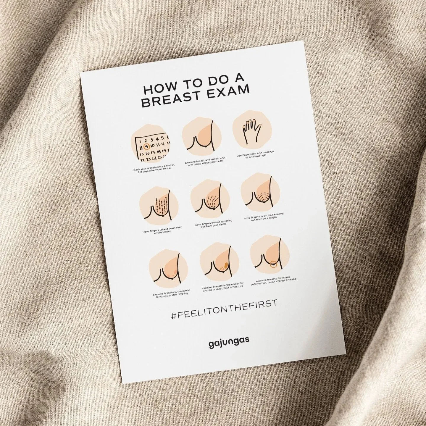
Illustration became central to answering those questions.
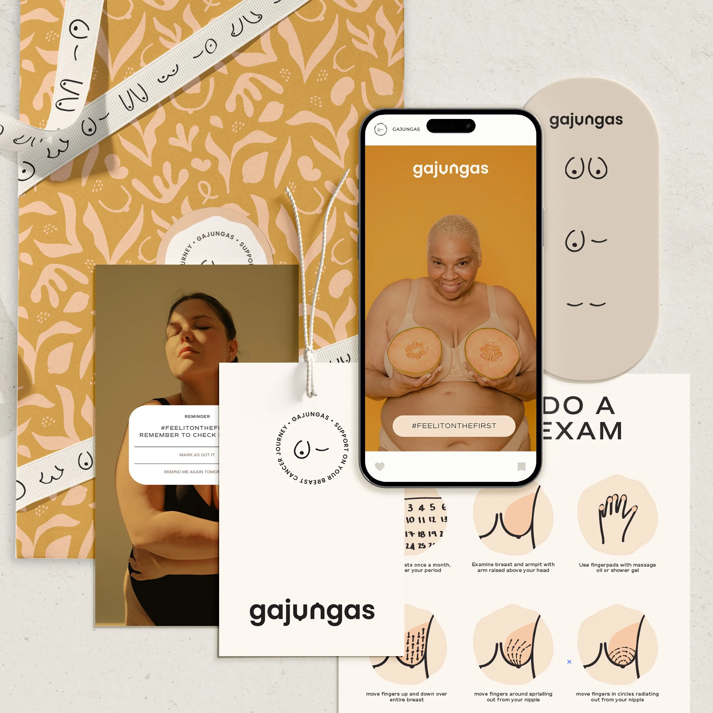
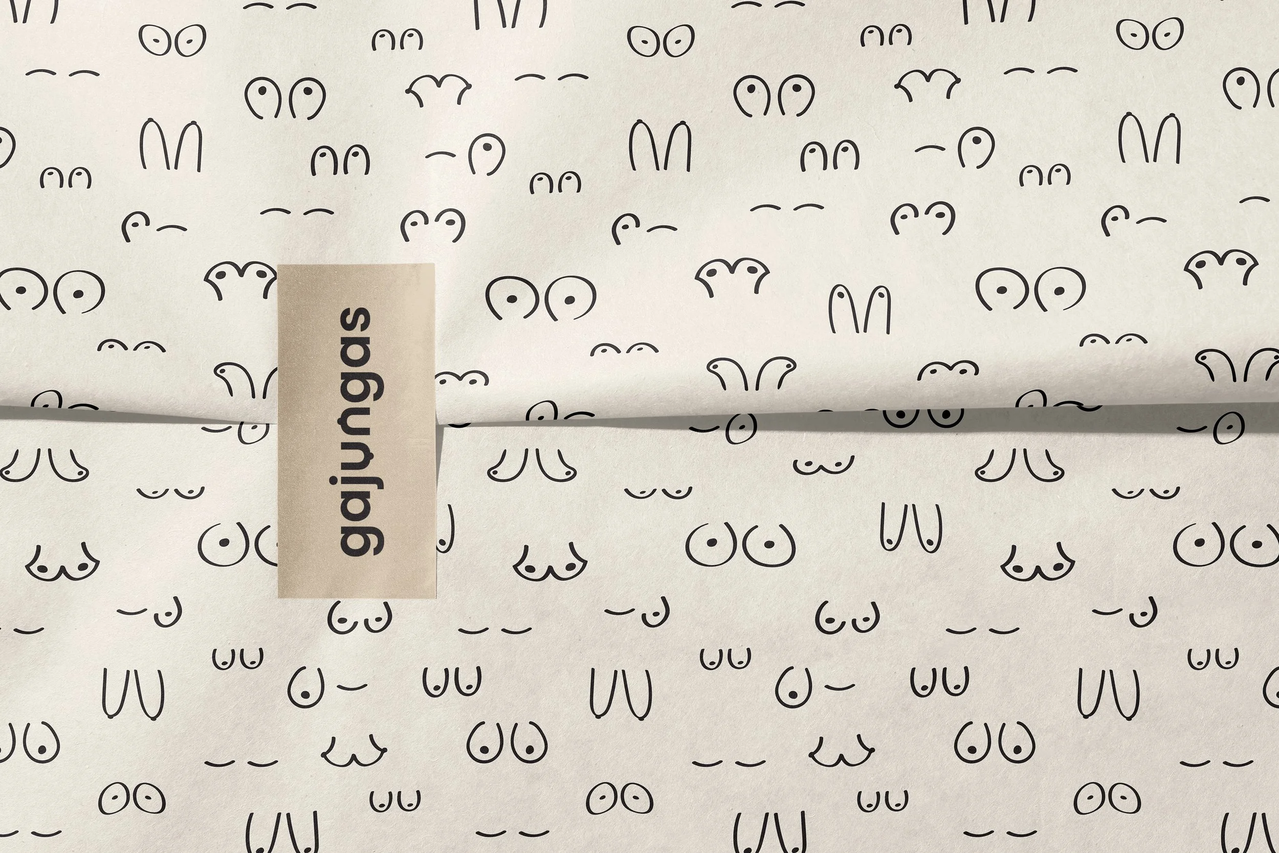
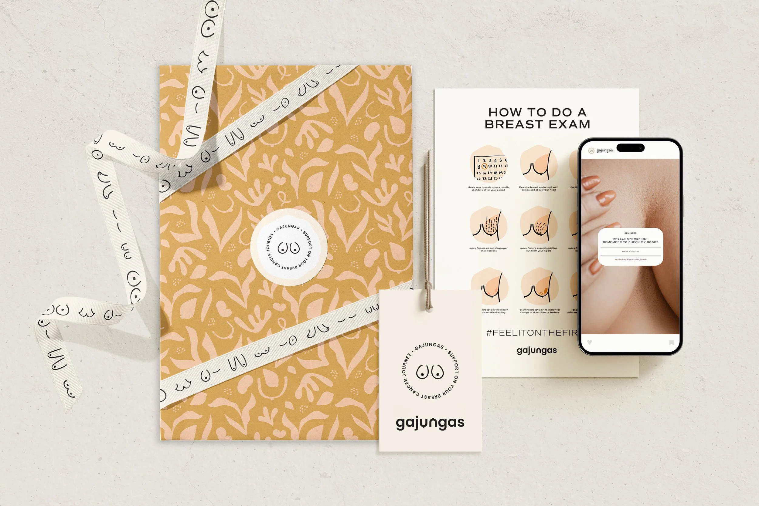
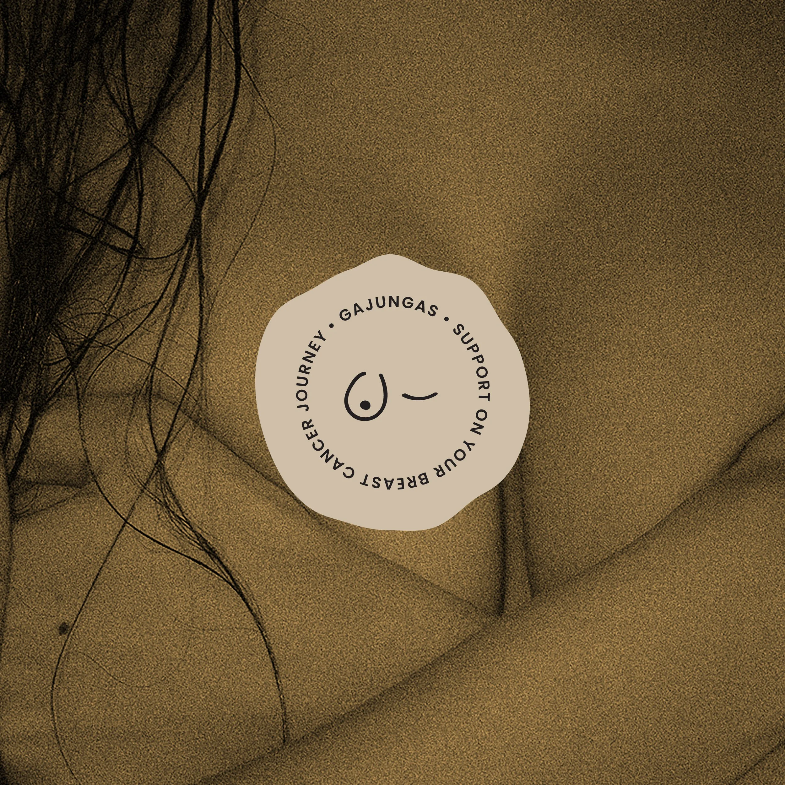
A distinctive visual language of breast forms, bodies and simplified educational graphics allowed information to be communicated with warmth and immediacy. Combined with bold typography, colour and a conversational tone, the identity gave Gajungas permission to speak openly about bodies without embarrassment or unnecessary seriousness.
The result was a brand system where personality wasn't decoration around the purpose — it was the mechanism for making that purpose more accessible.
3. THE EXPERIENCE
Creating everyday moments that keep the conversation visible.
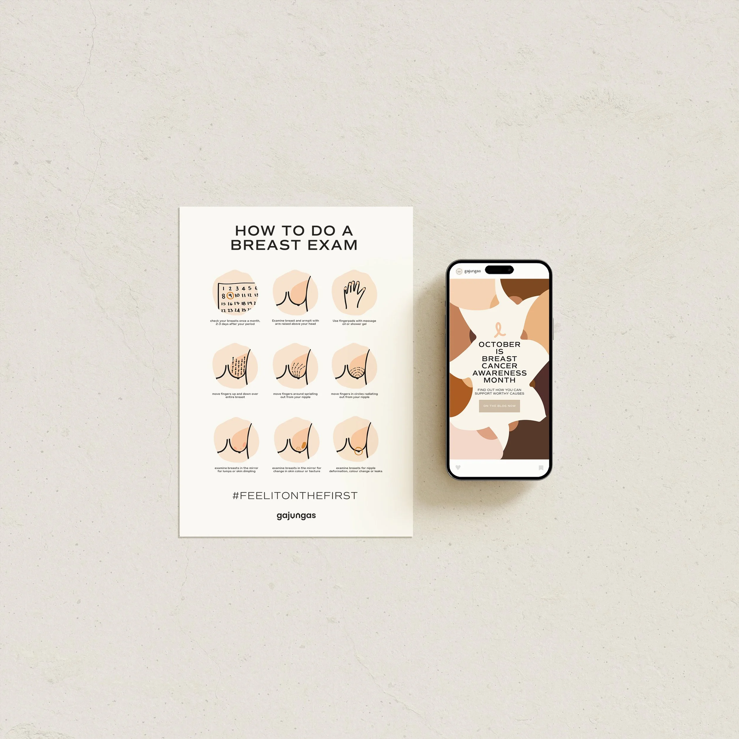
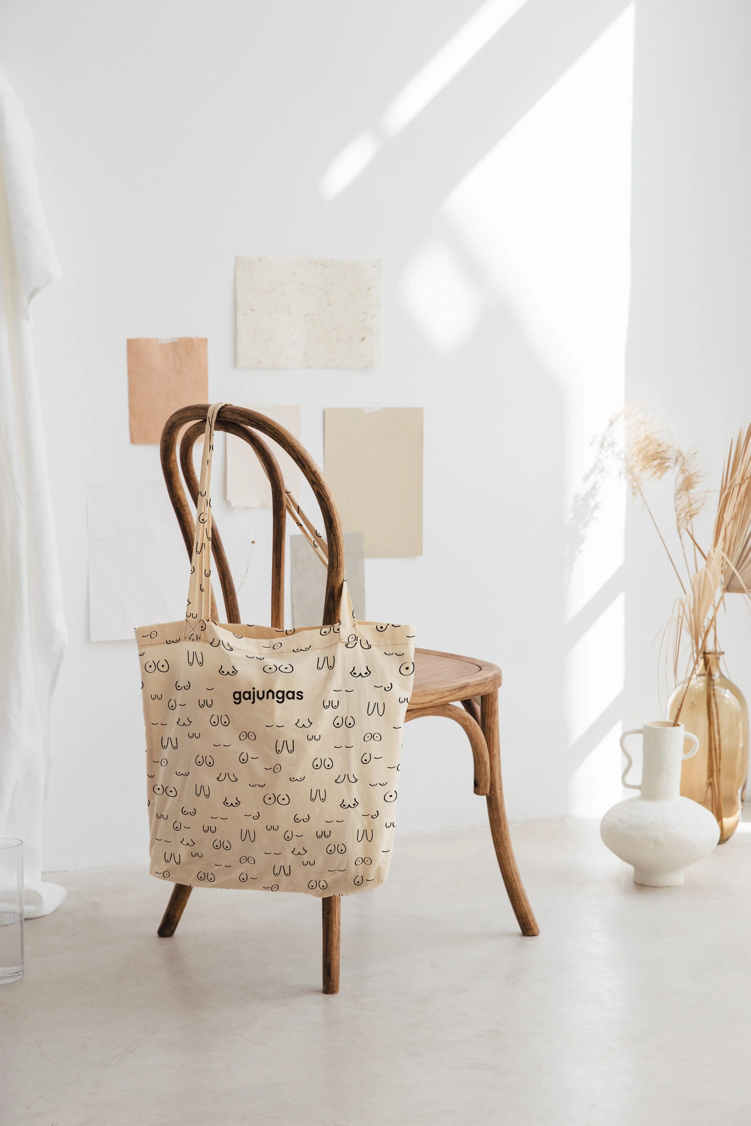
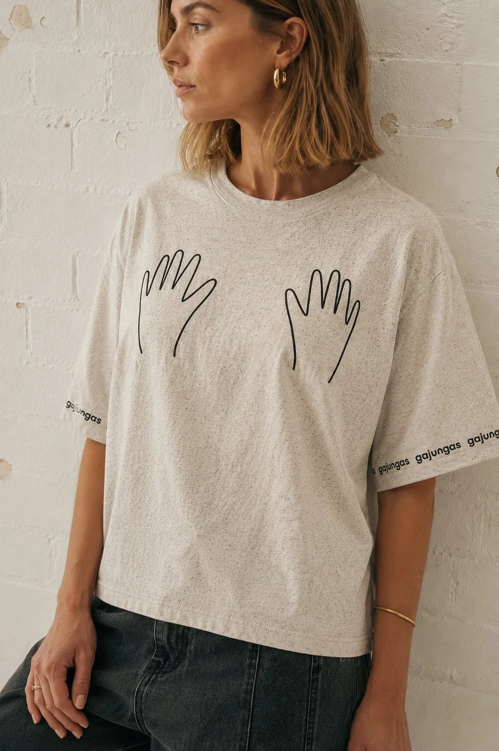
The identity was designed to extend beyond a logo into a flexible communication system spanning educational material, packaging, products, social content and digital touchpoints.
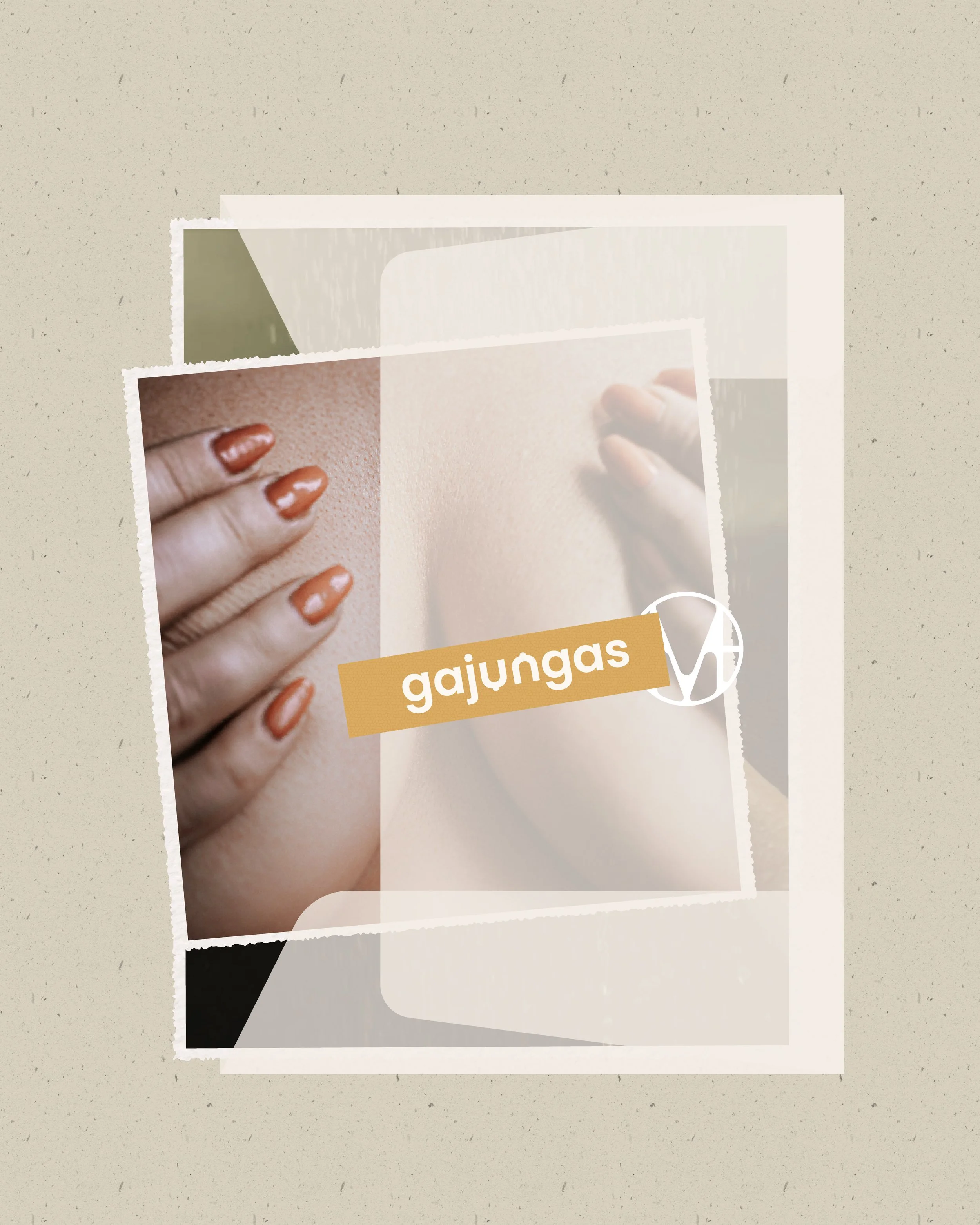
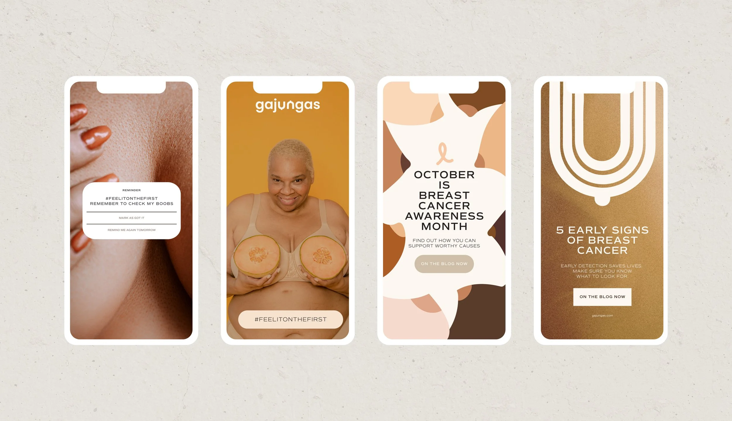
Illustration could explain a checking technique in one moment and become a playful graphic device in another. Packaging could carry useful information rather than simply identifying a product. Social content could move naturally between education, reminders and conversation without losing the recognisable character of the brand.
This created an experience that felt cohesive without becoming repetitive - giving Gajungas a broad visual vocabulary while keeping its purpose consistently present.
Most importantly, it allowed breast awareness to move out of a purely medical context and into the everyday objects, routines and conversations where habits are actually formed.
4. THE OUTCOME
A brand that makes an important message easier to see, understand and remember.
The final identity gives Gajungas a distinctive place within the breast-awareness space: optimistic, expressive and unmistakably human.
Rather than building the brand around illness or fear, the visual world centres awareness, familiarity and action. The seriousness of the message remains intact, but the experience of receiving it changes.
The result is a brand capable of educating without lecturing and prompting action without creating alarm - transforming an important health message into something people can more comfortably engage with as part of everyday life.
5. FINAL THOUGHTS
Sometimes design's role isn't to make a message louder. It's to make it easier to approach.
Gajungas is a project about the distance design can close.
Between health information and the person who needs it. Between knowing something matters and actually doing something about it. Between a subject that can feel uncomfortable and a conversation that becomes normal.
By bringing warmth, humour, illustration and humanity to breast awareness, the identity helps remove some of the barriers surrounding the subject while respecting the importance underneath it.
Because when a message matters, making people feel comfortable enough to engage with it can be just as important as the message itself.